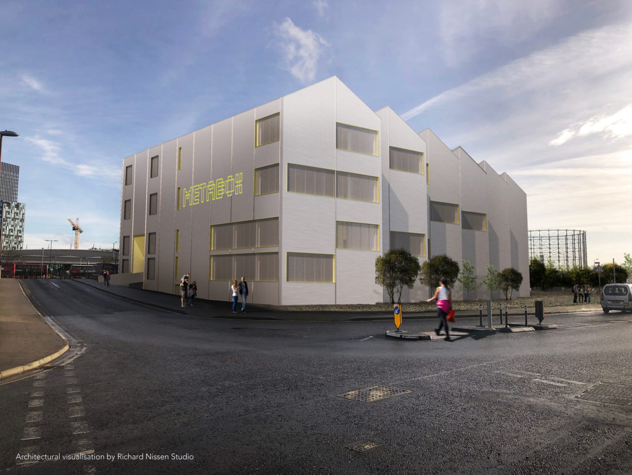
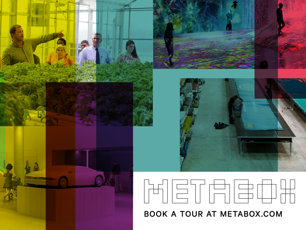
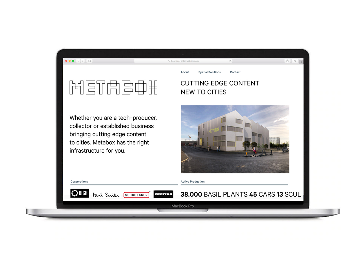
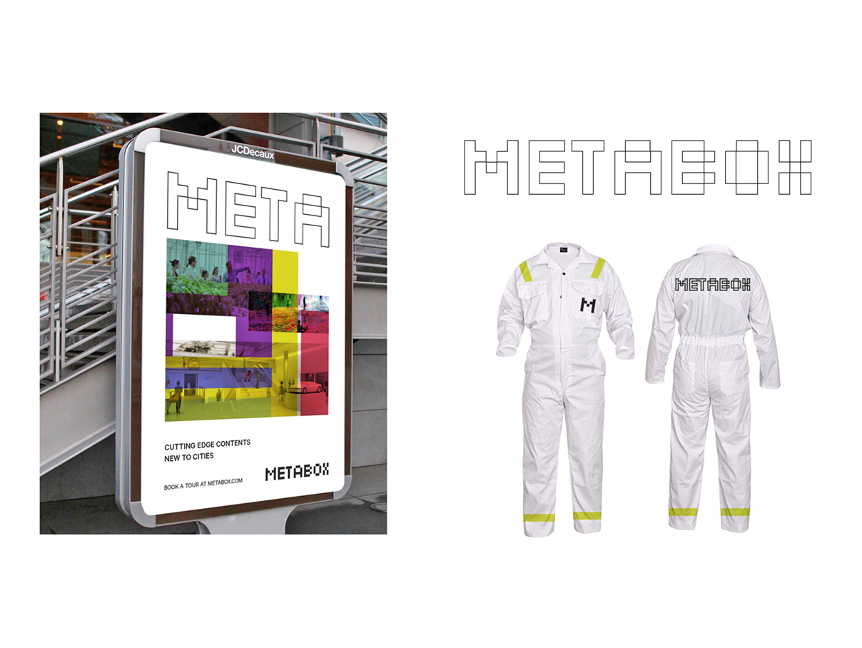
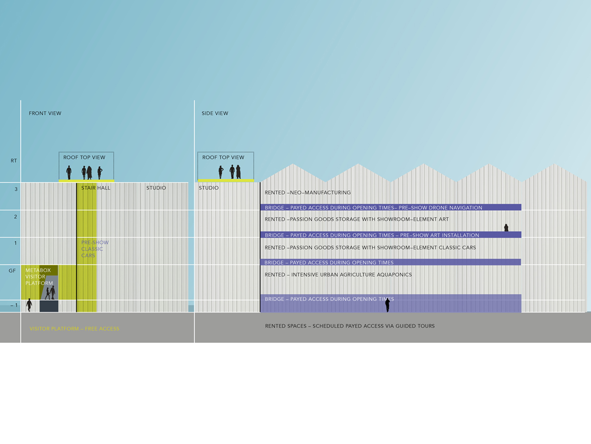
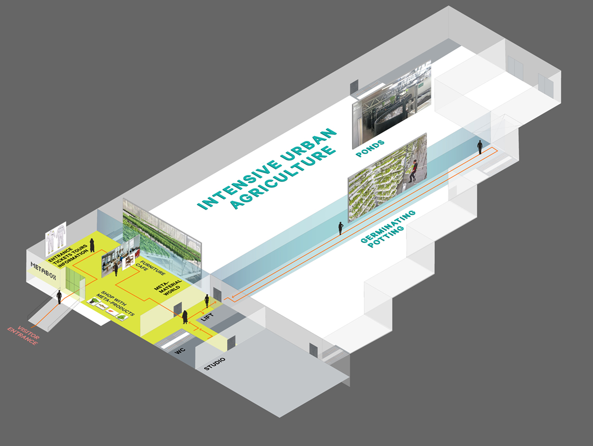
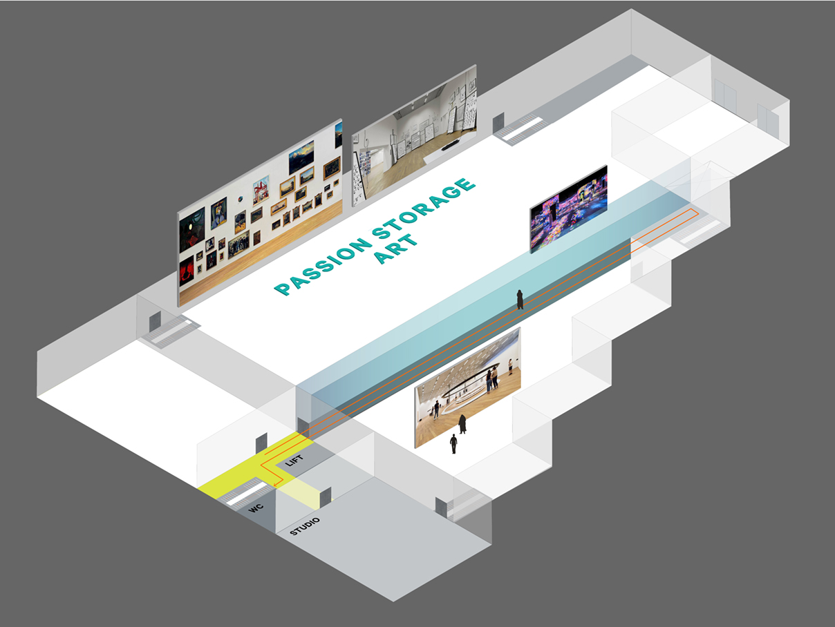
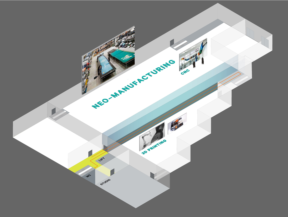
METABOX
WAREHOUSE | LONDON DOCKLANDS
On behalf of the strategy consultancy Arthesia, I have been working on the look and feel, the visitor journey and visual identity of Metabox – a new, innovative destination in the London Docklands area with cutting–edge content new to cities such as urban agriculture, neo–manufacturing, art storage, drones, etc.
Several floors of real, industrial content in an intelligent warehouse also serving as a visitor attraction at the same time. The core idea evolved around an all access platform which organically combines the entrance information with a harvest point, material lab, furniture store and cafe.
TEAM: Arthesia AG, Richard Nissen Studio, architecture and architectural visualisations
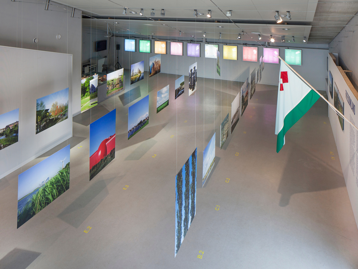
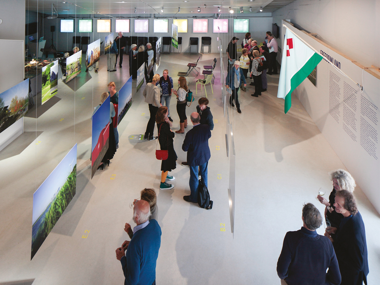
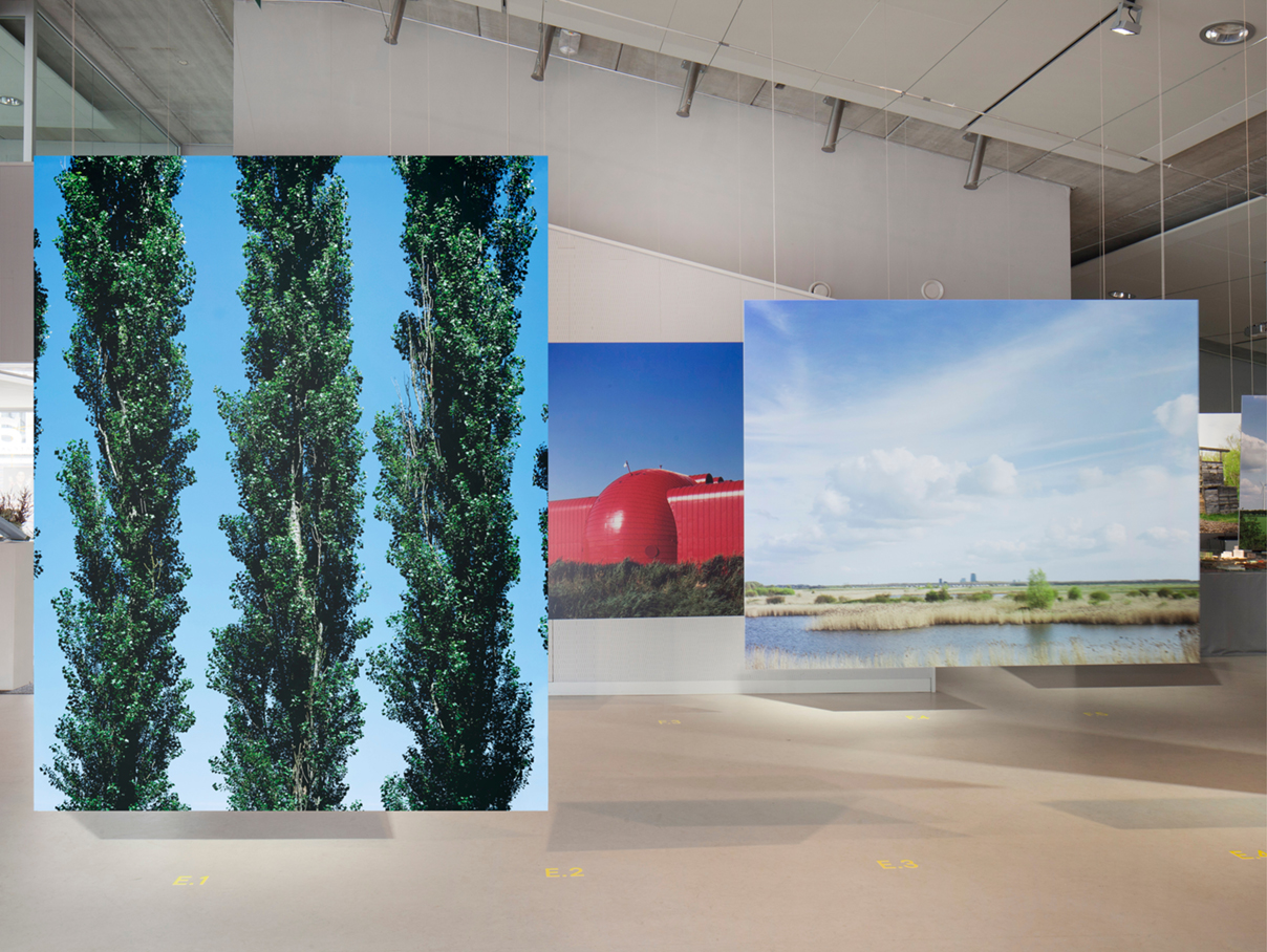
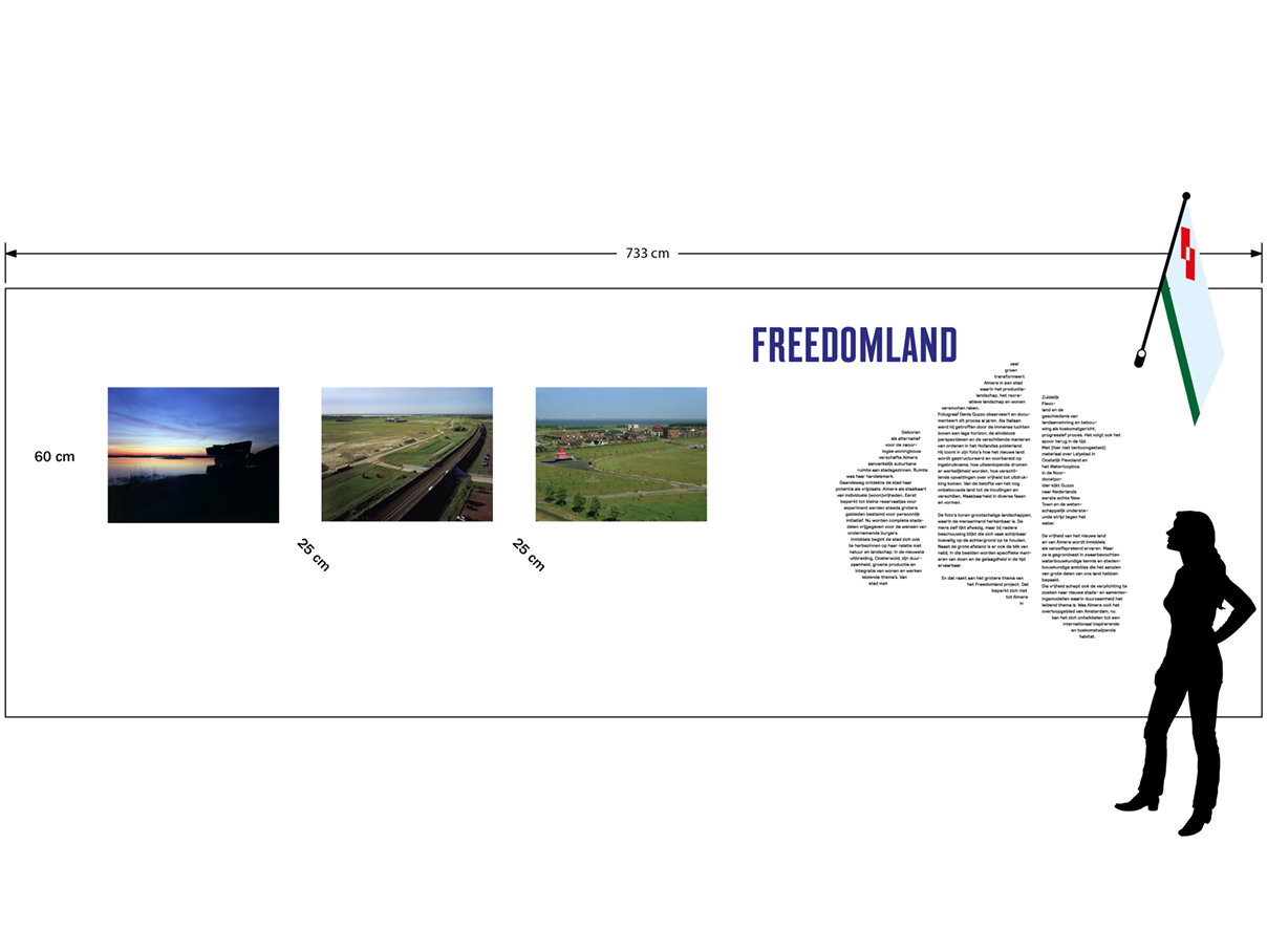
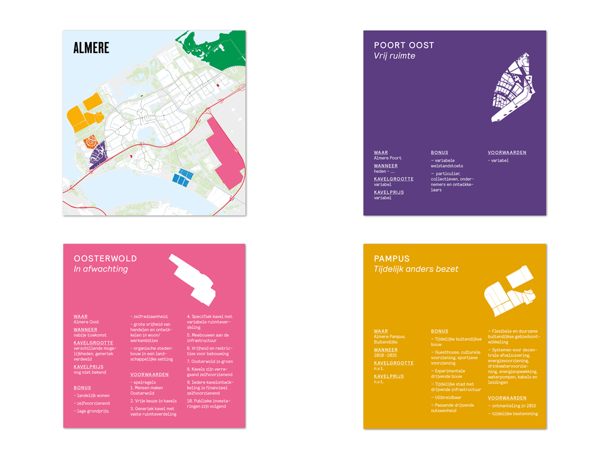
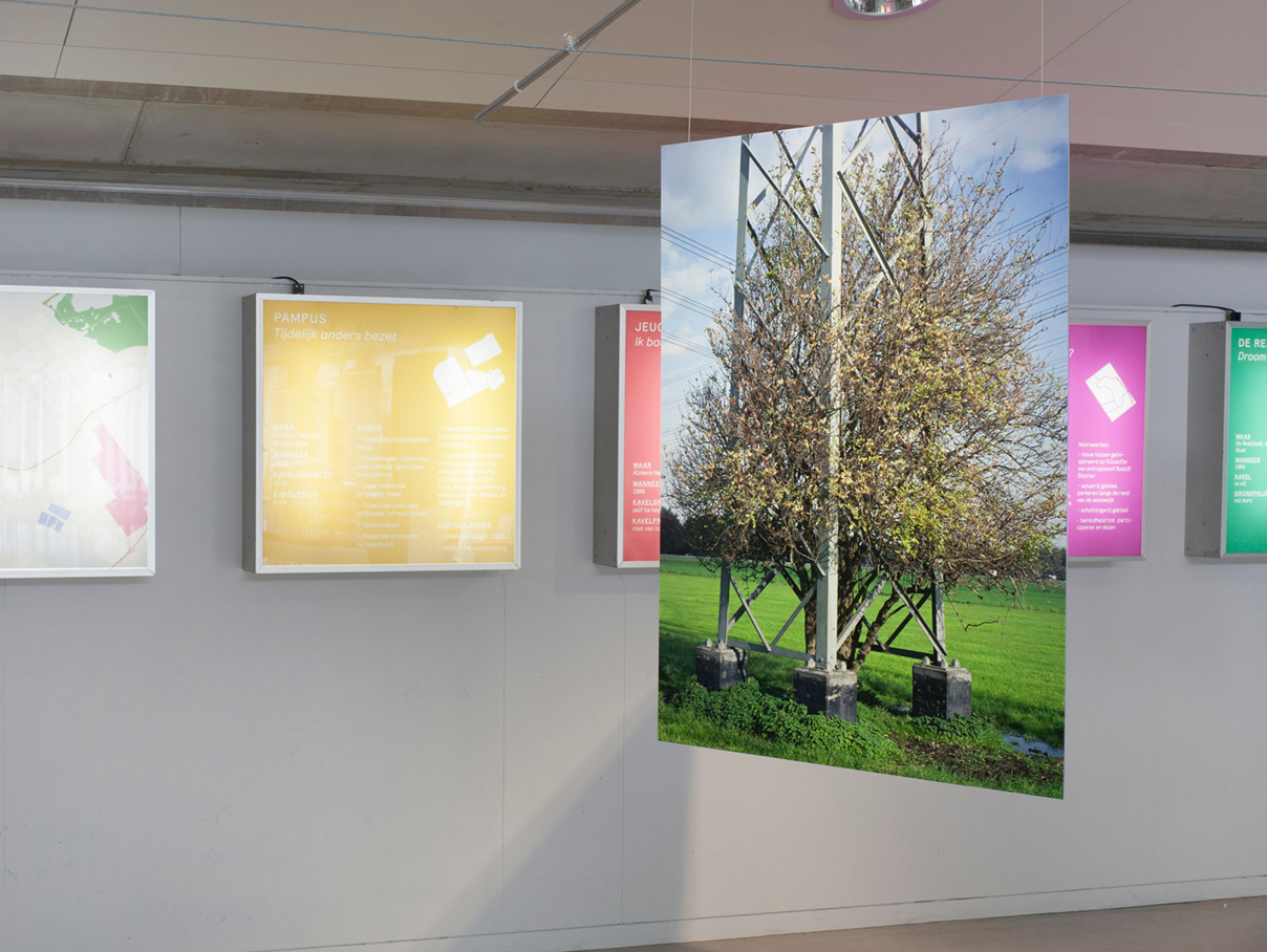
FREEDOMLAND
CASLA ARCHITECTURE CENTRE | ALMERE
If anything, freedom is what you feel when first confronted with the Dutch Flevo polders; freedom and perhaps a sense of being lost in space. The low horizons, immense skies, and endless perspectives are that of a desert landscape – albeit with a human element. But how to interpret such a unique landscape? How to settle and live there?
Freedomland is a visual journey into a highly regulated man made land; captured between forces of order and space, concept and execution, authority and freedom and expressed as a new conceptual territory.
TEAM: Denis Guzzo i.c.w. Casla Architecture Centre in Almere
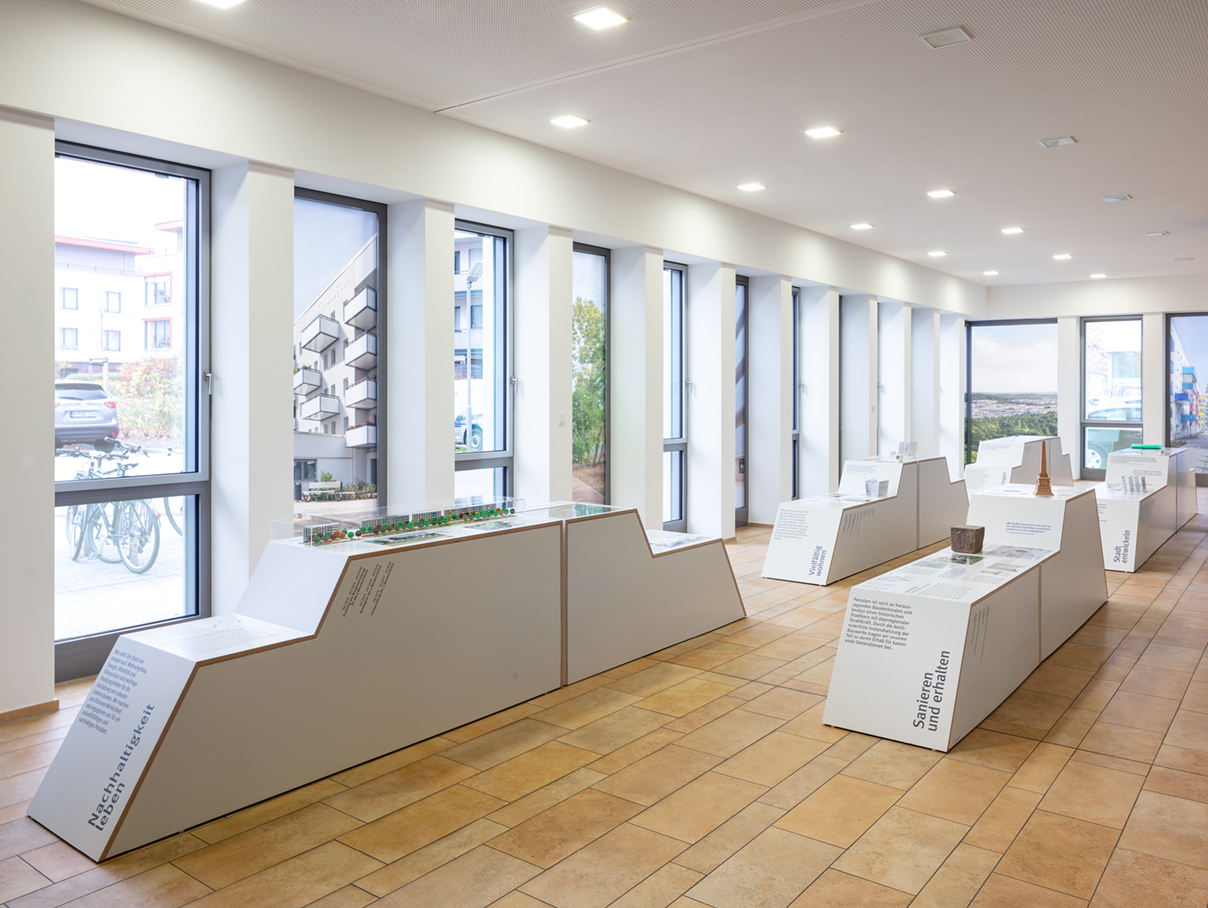
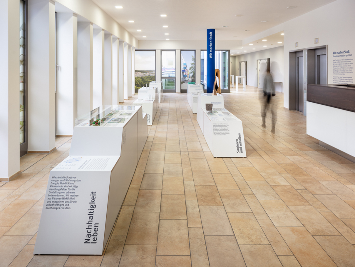
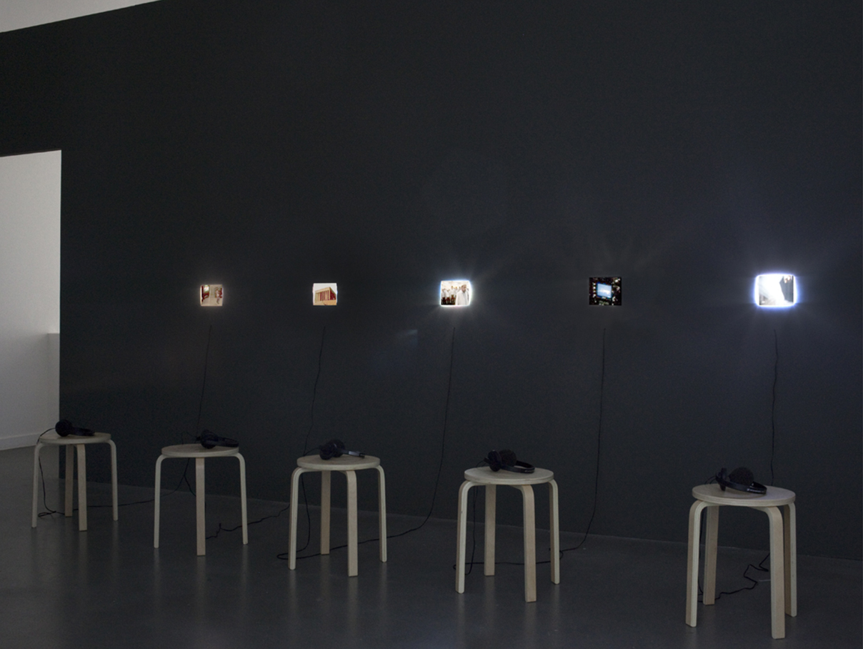
WE MAKE CITY
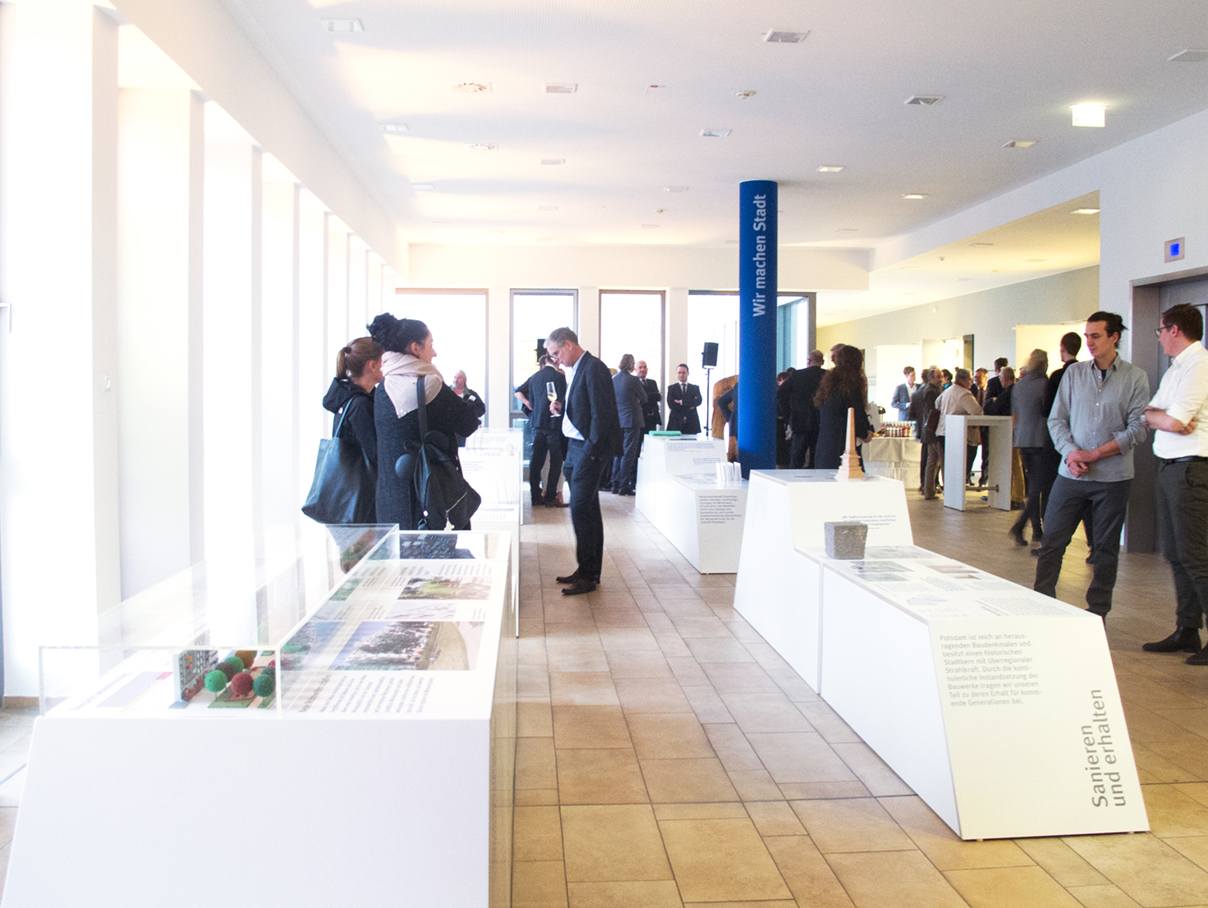
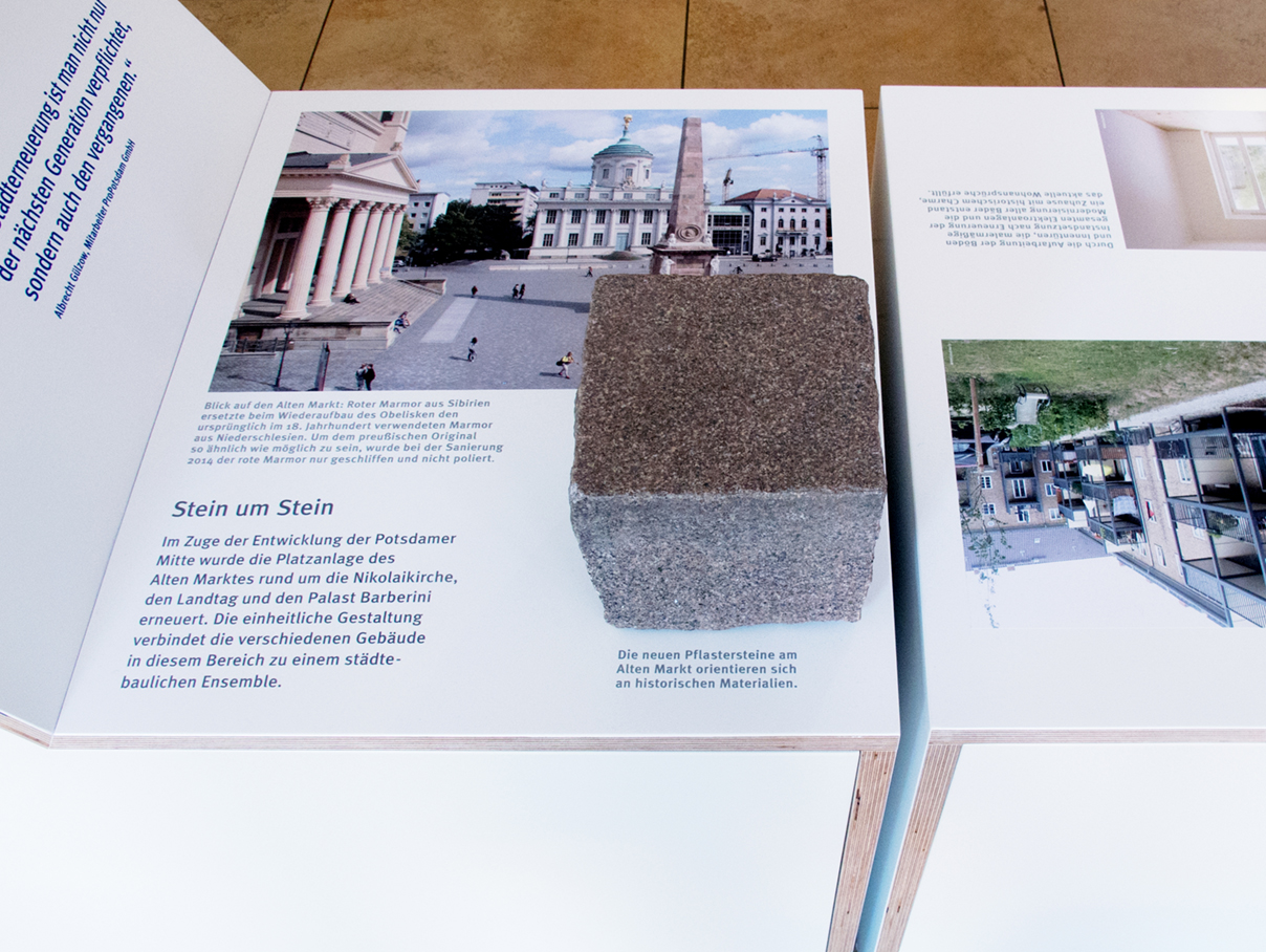
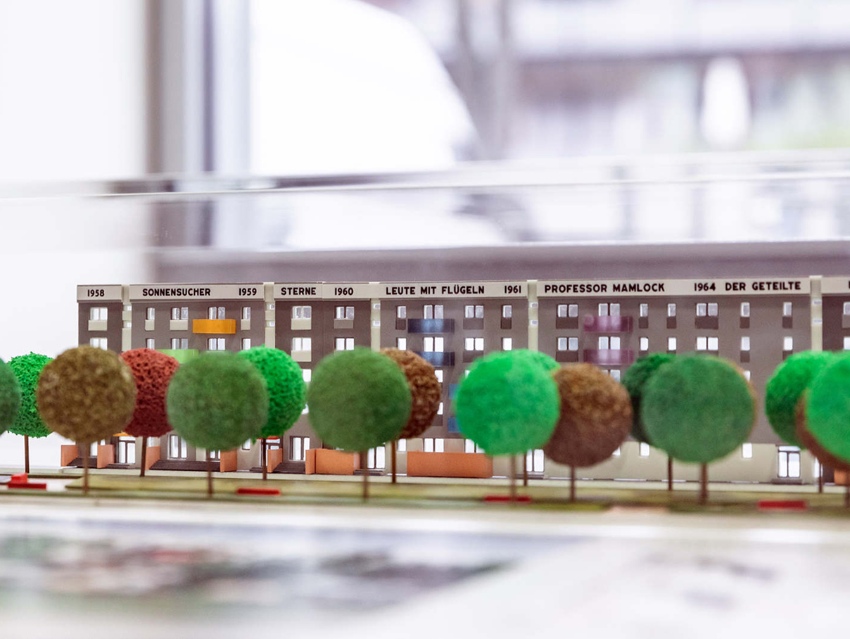
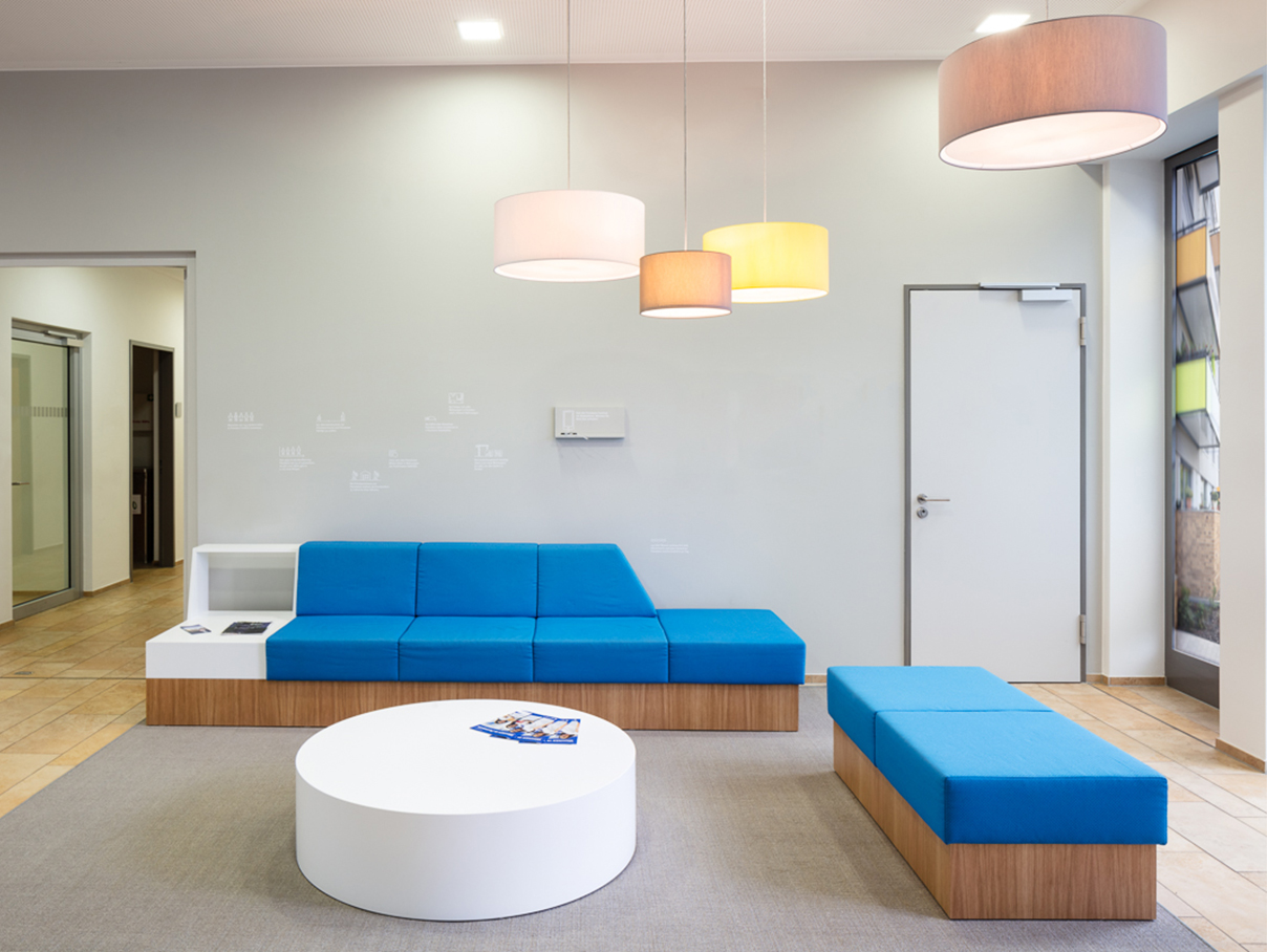
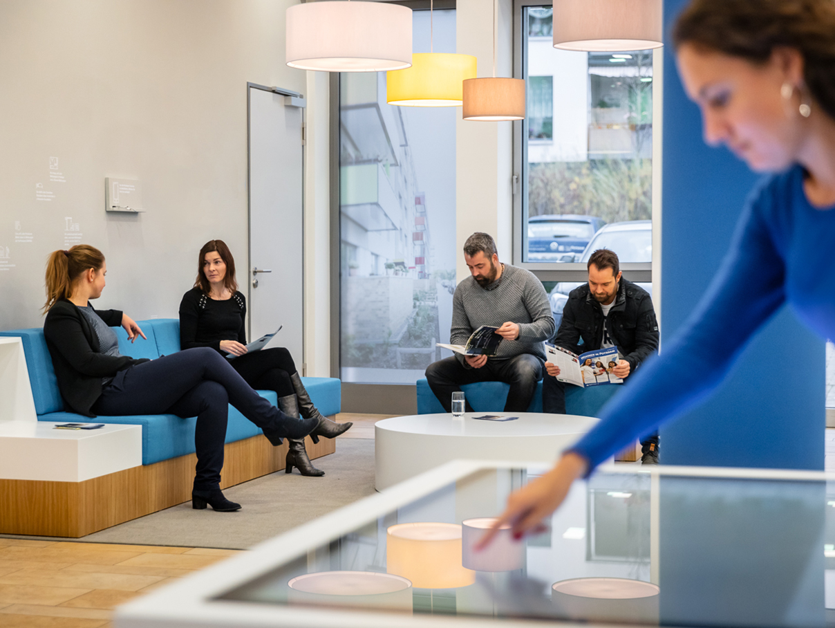
FOYER PROPOTSDAM | POTSDAM
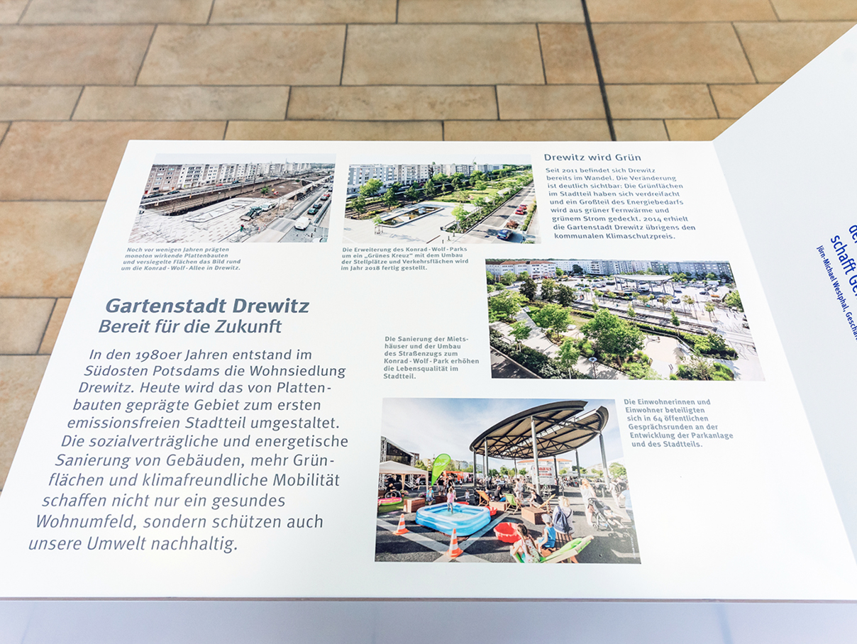
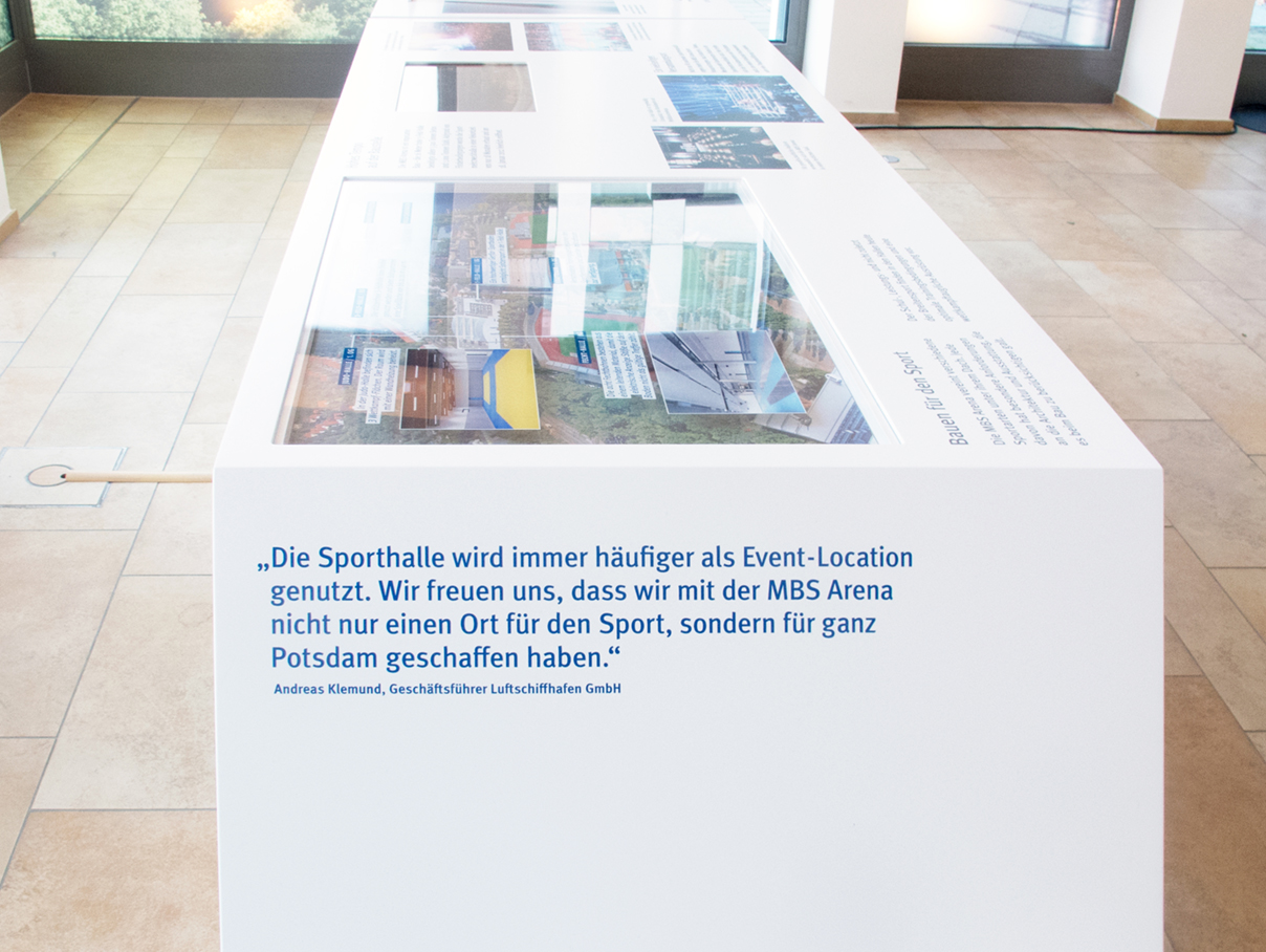
Concept and design for ProPotsdam’s foyer and exhibition. The exhibition modules are showcasing the different working fields of ProPotsdam from the past 20 years and can be relocated to different locations in the city after.
Each section highlights one story through a related object, which we initiated and curated. For example, the completed school development is shown by drawings of the students of their favorite places inside, which we initiated with a workshop there.
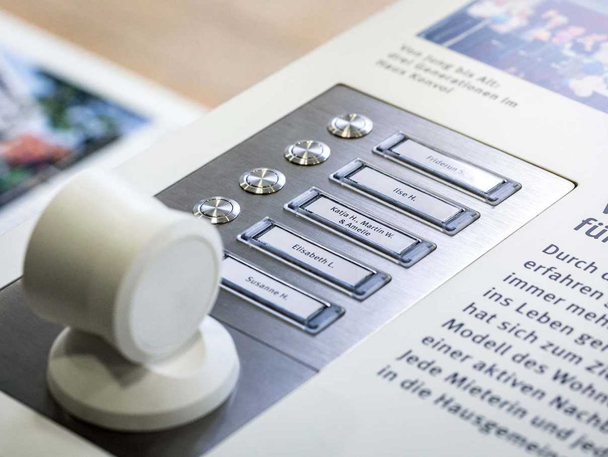
In the multi-generational housing project, we conducted interviews with the tenants, which are made accessible on the exhibition module by means of bells and a receiver.
TEAM: ProPotsdam in Potsdam > Nominated for the Design Award Brandenburg, Brigitta Bungard communication design, Daniela Walz text, Neubauen furniture and module production, Markus Lerner digital design, Janusz Kruszewski architectural models, Sevens and Maltry photography
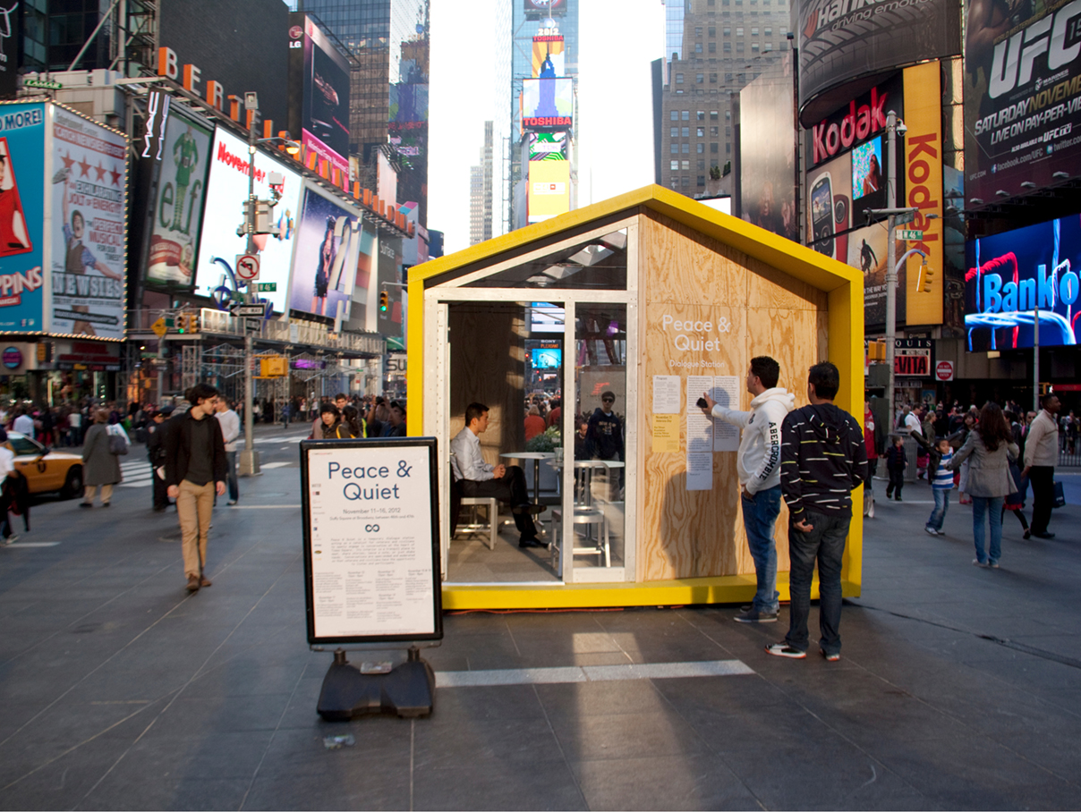
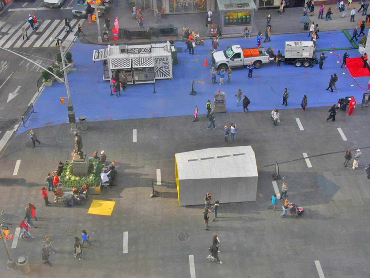
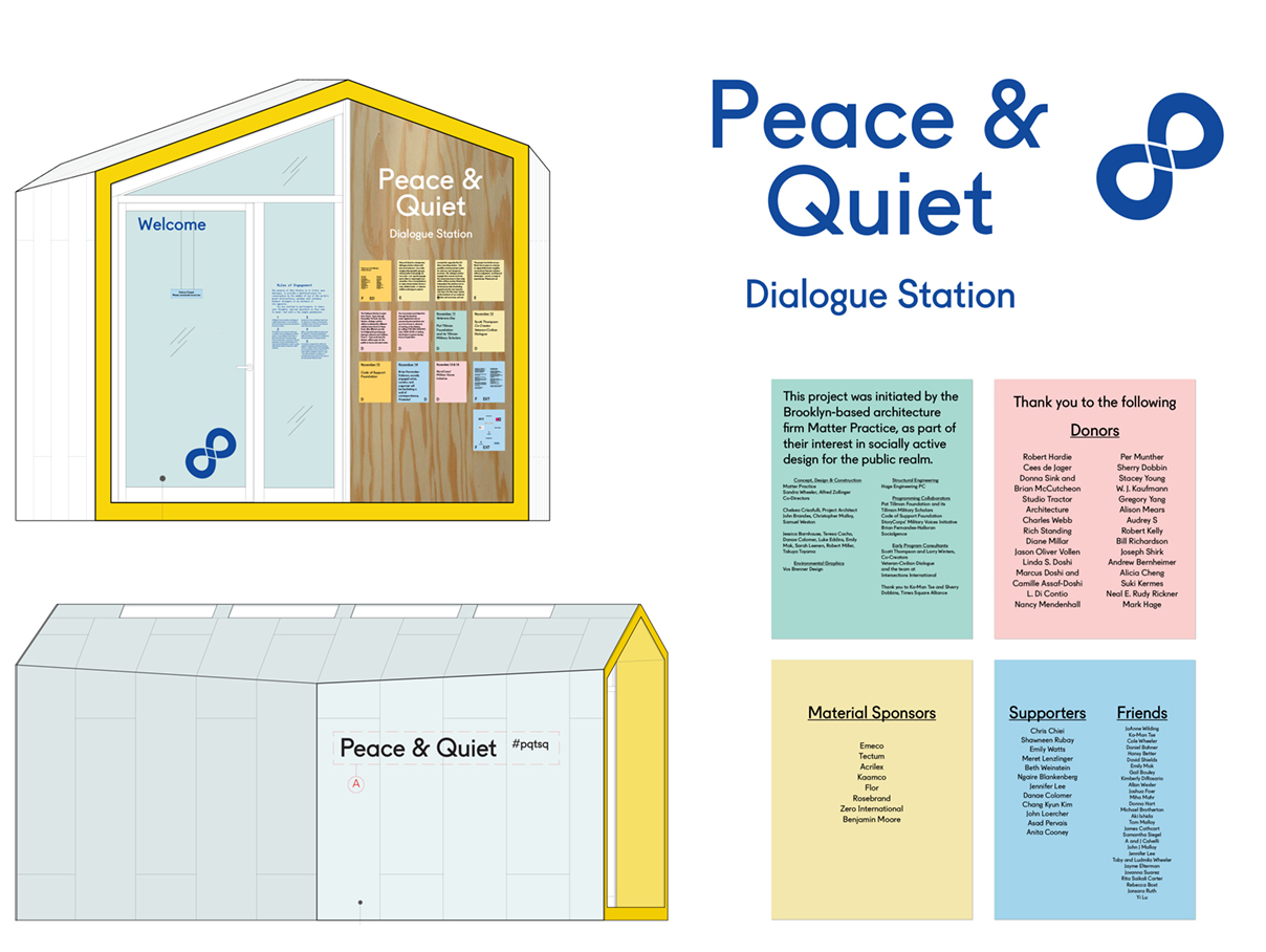
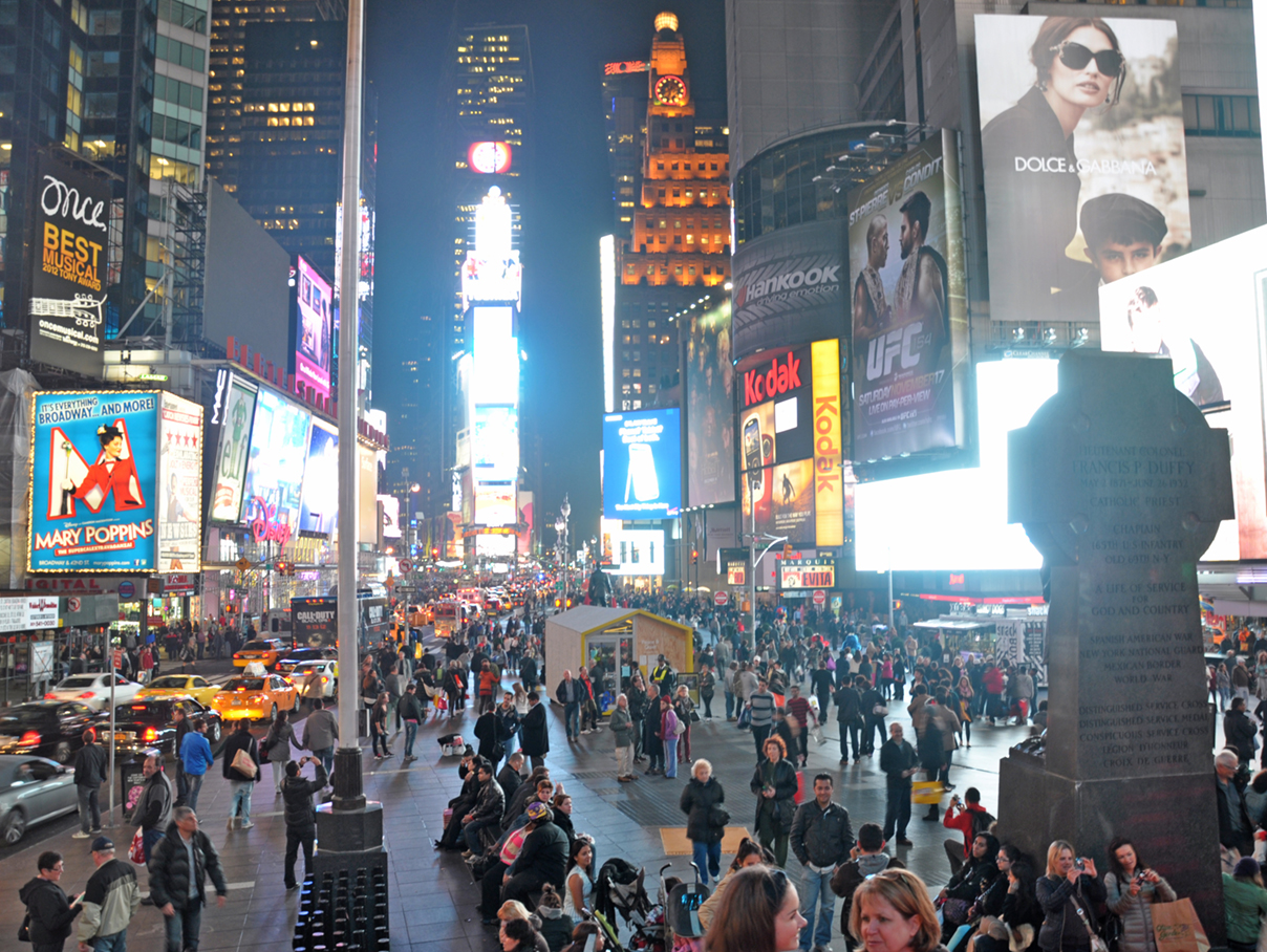
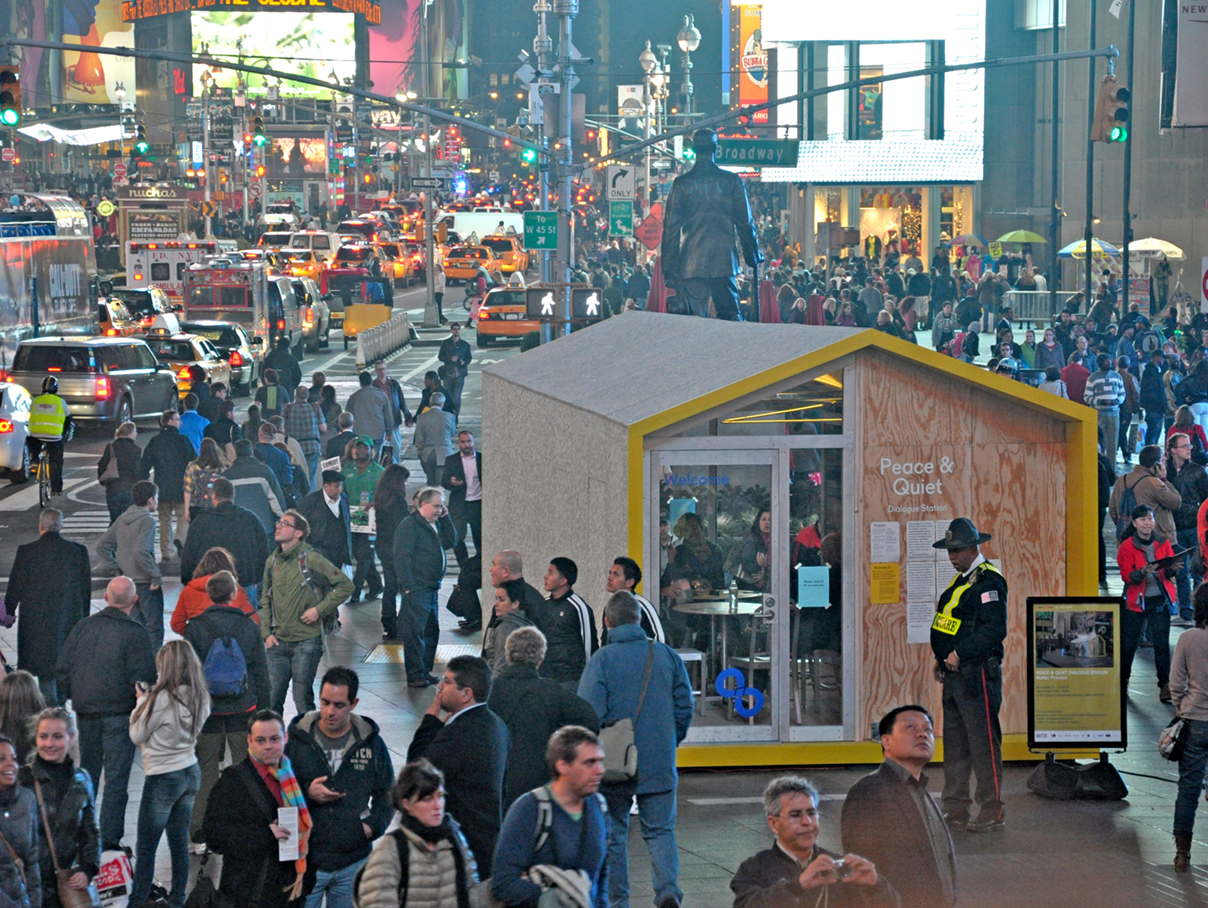
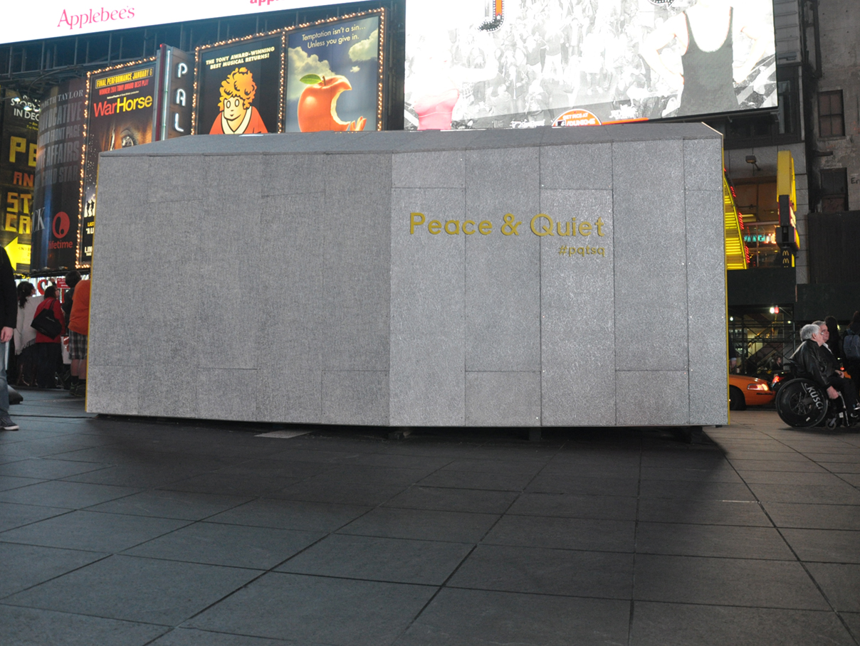
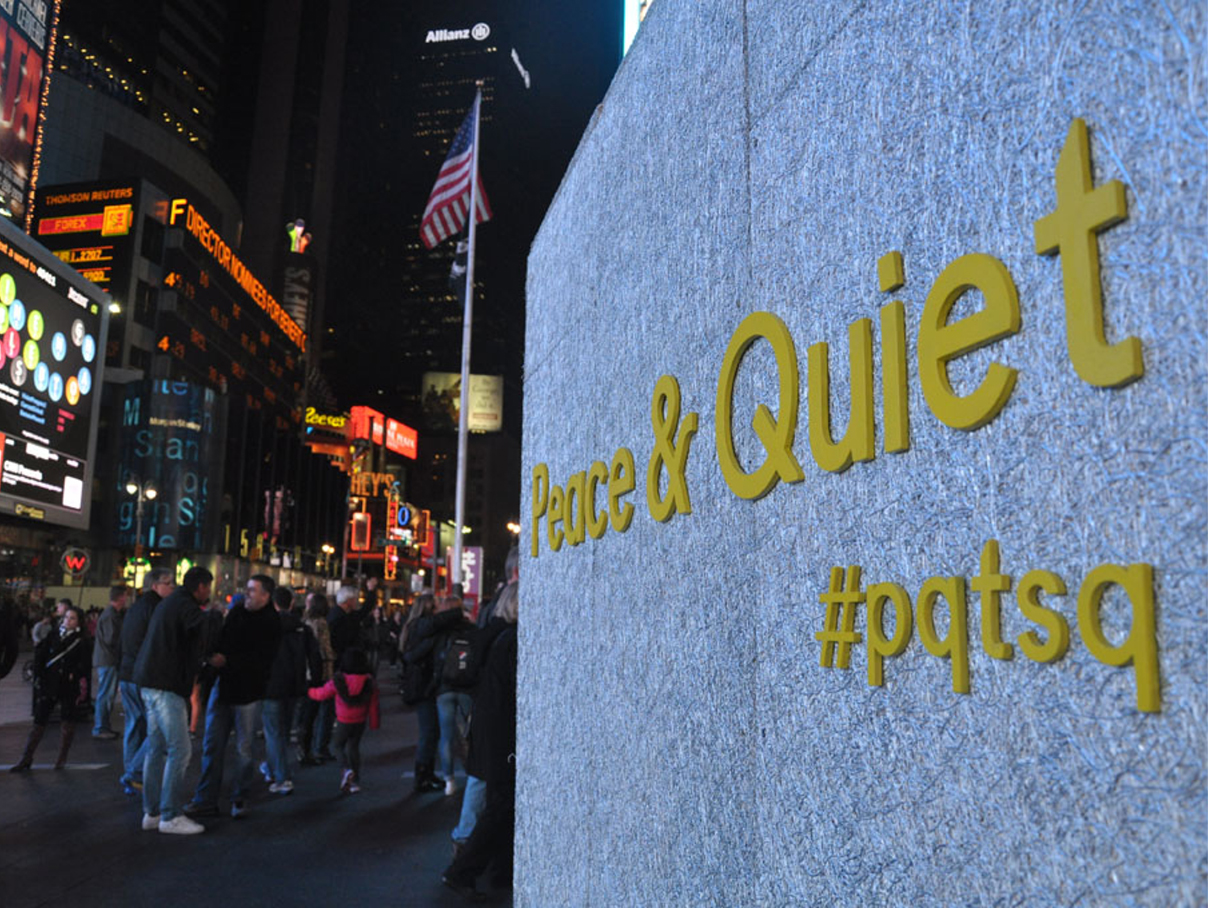
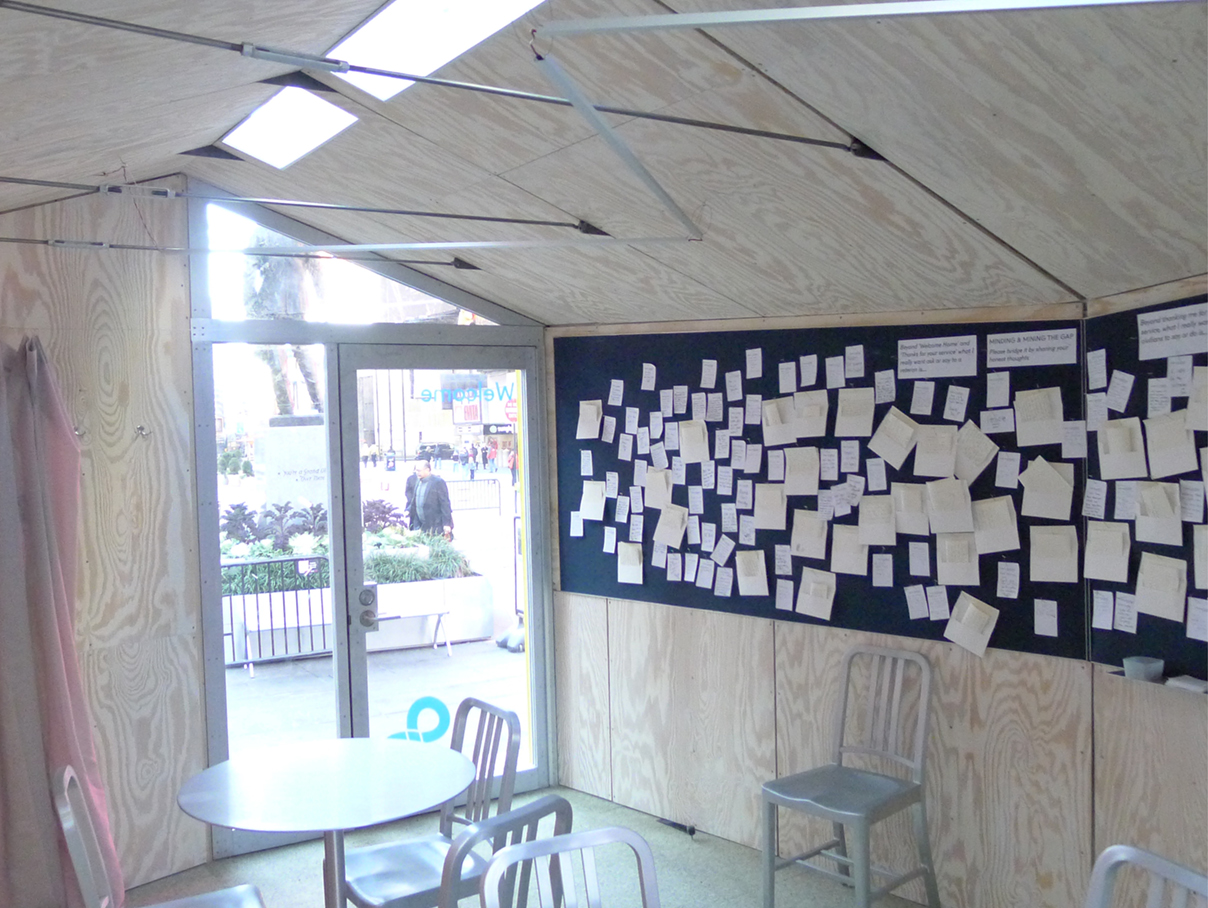
PEACE & QUIET
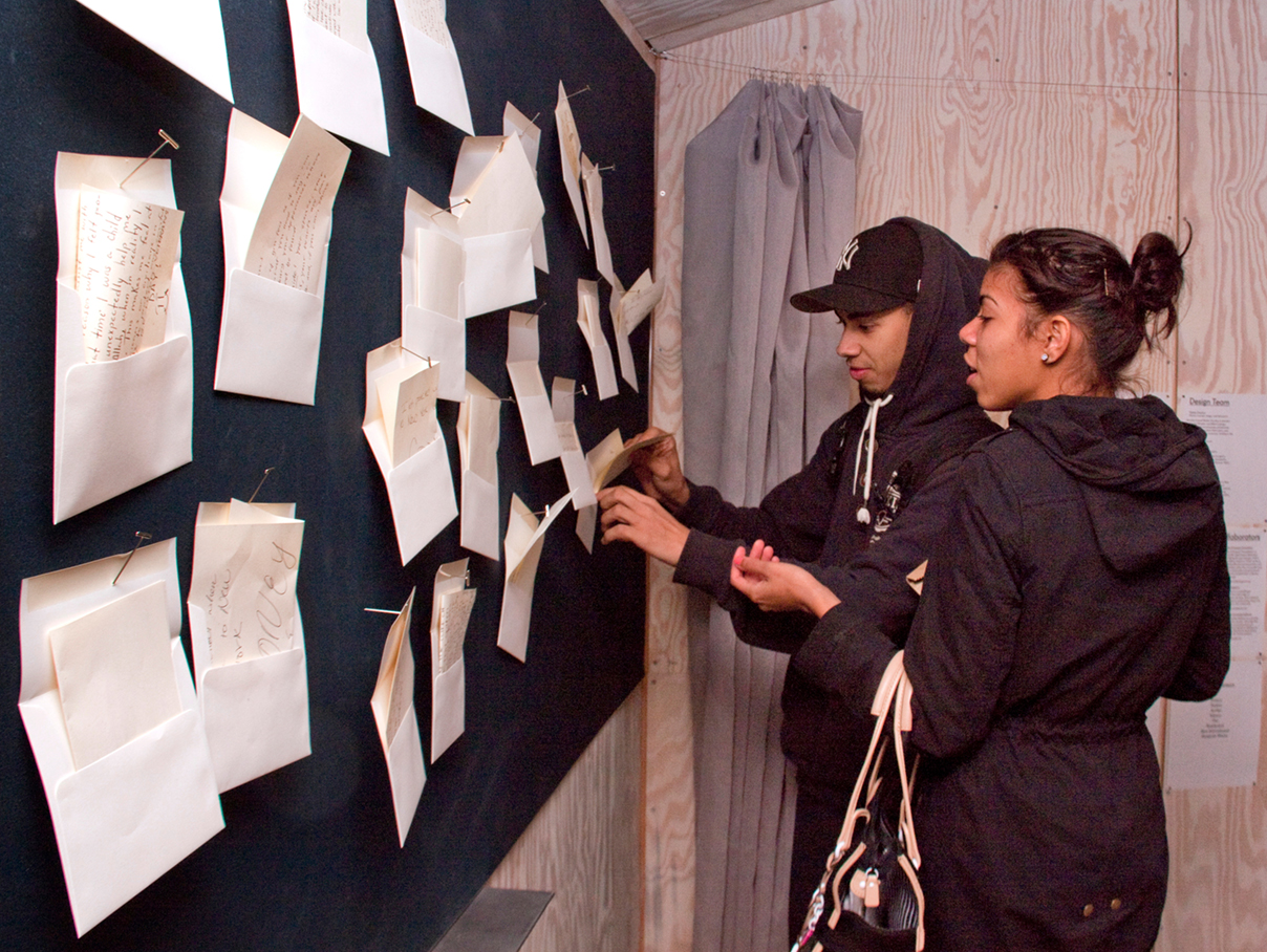
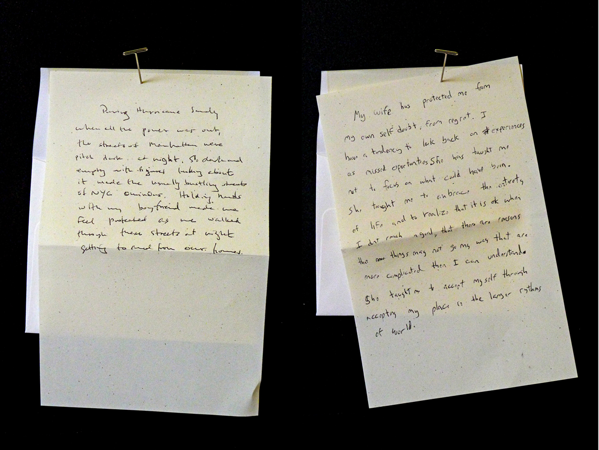
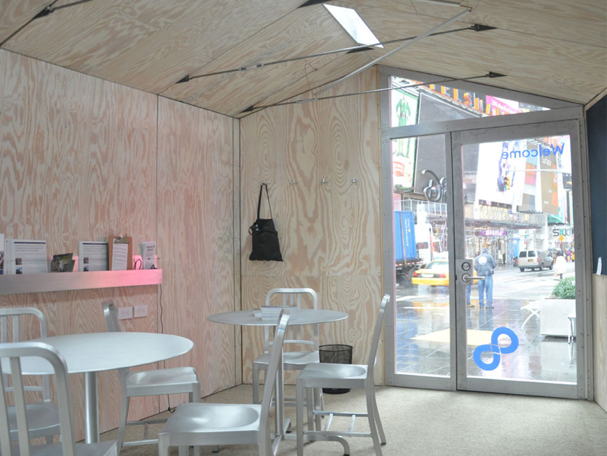
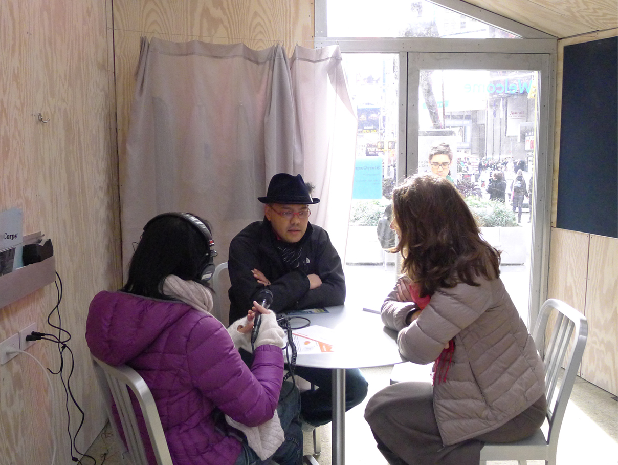
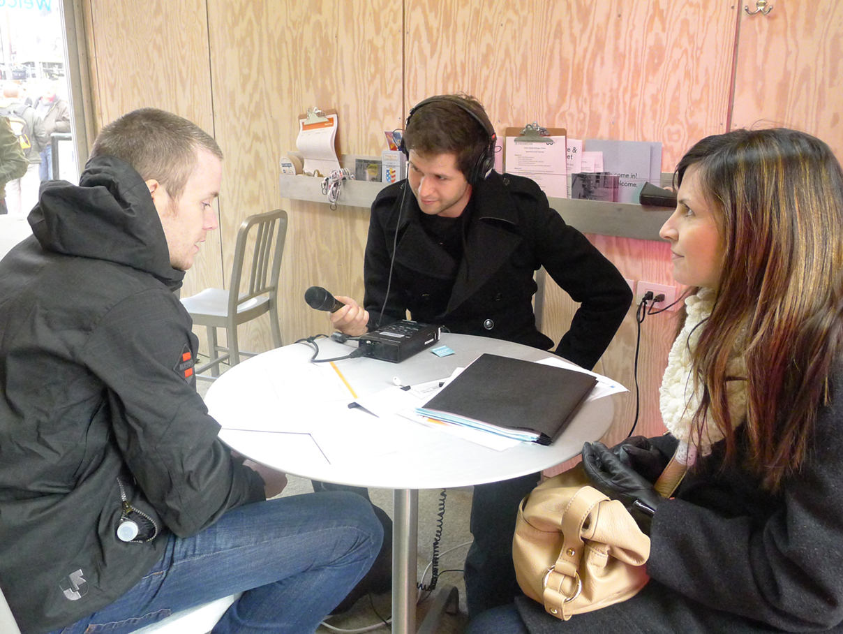
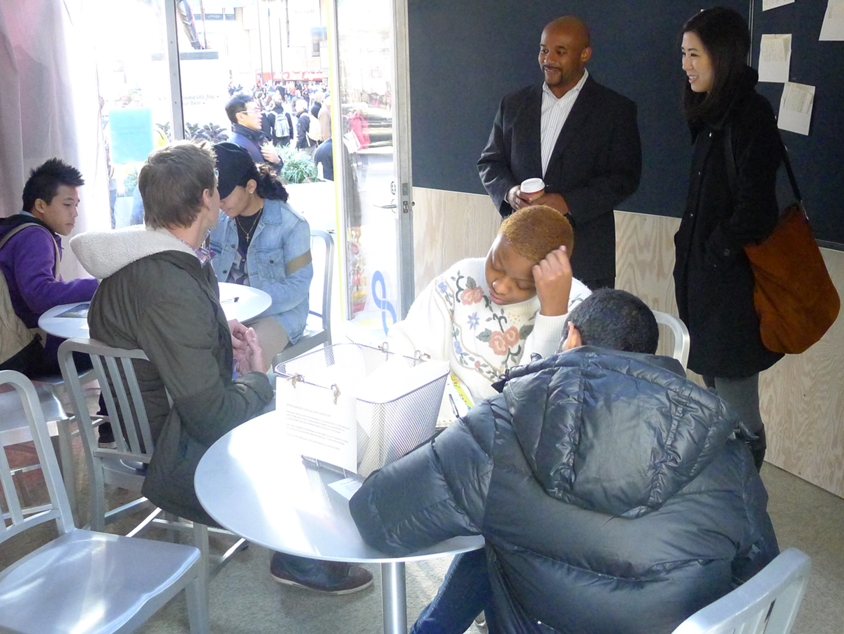
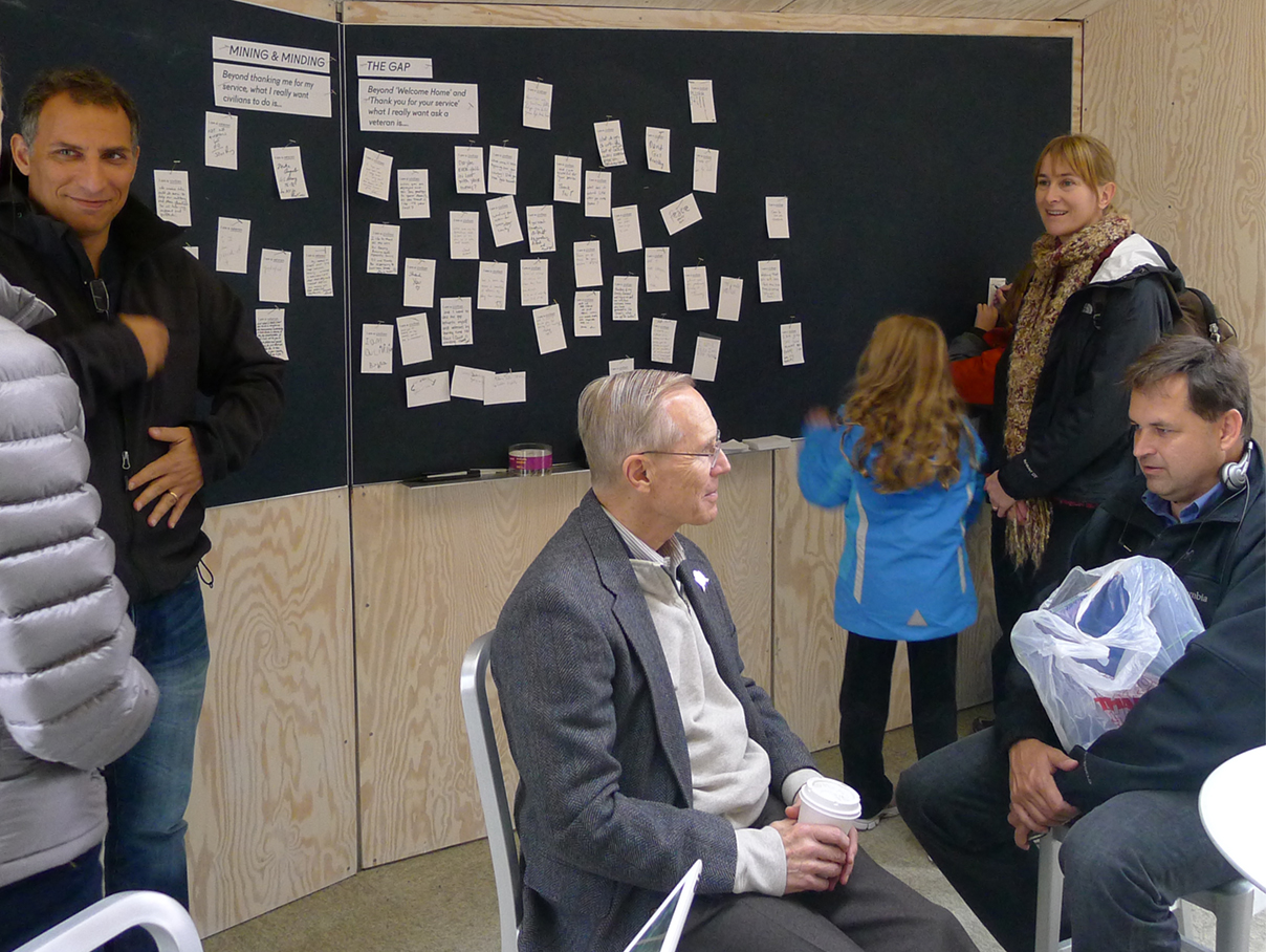
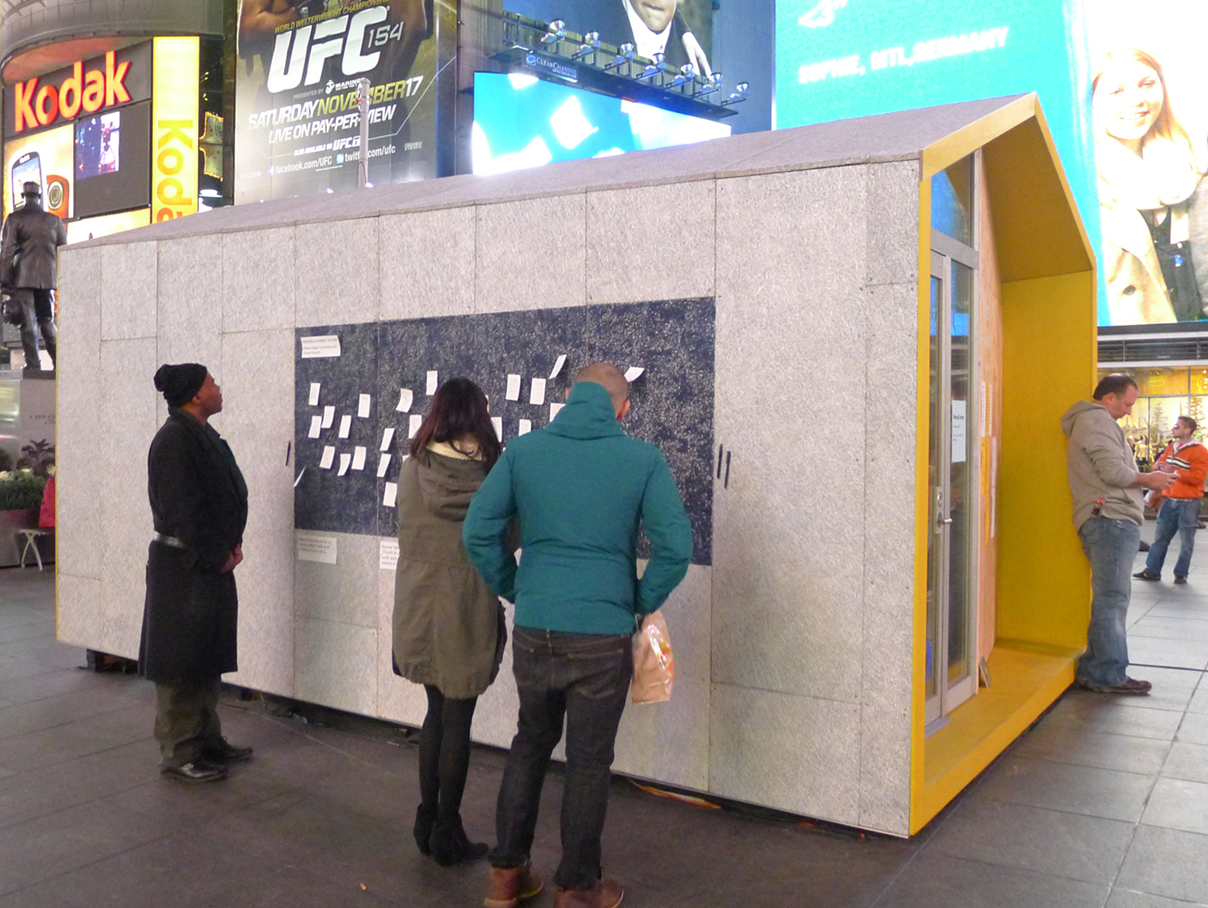
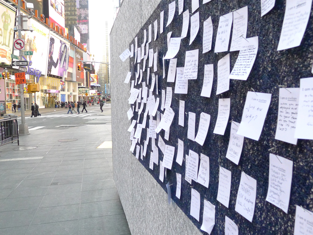
CIVIC DIALOGUE STATION | NEW YORK CITY
I created the visual–identity and environmental graphics for Peace & Quiet, a civic ‘dialogue station’ in Times Square. Peace & Quiet sought to stimulate public discussion by facilitating an open dialogue between American veterans and civilians in this iconic public square.
Over the course of the three–week installment, the dialogue station hosted various discussions, some of which were recorded as part of the National Archive. Notes and letters were also written and exchanged.
TEAM: Times Square Alliance in New York City, Matter Architecture Practice (design and construction), Pat Tillman Foundation and its Tillman Military Scholars, Storycorps’ Military Voice Initiative, Code Support Foundation, Socialgence and Brian Fernandes-Halloran (program collaborators)
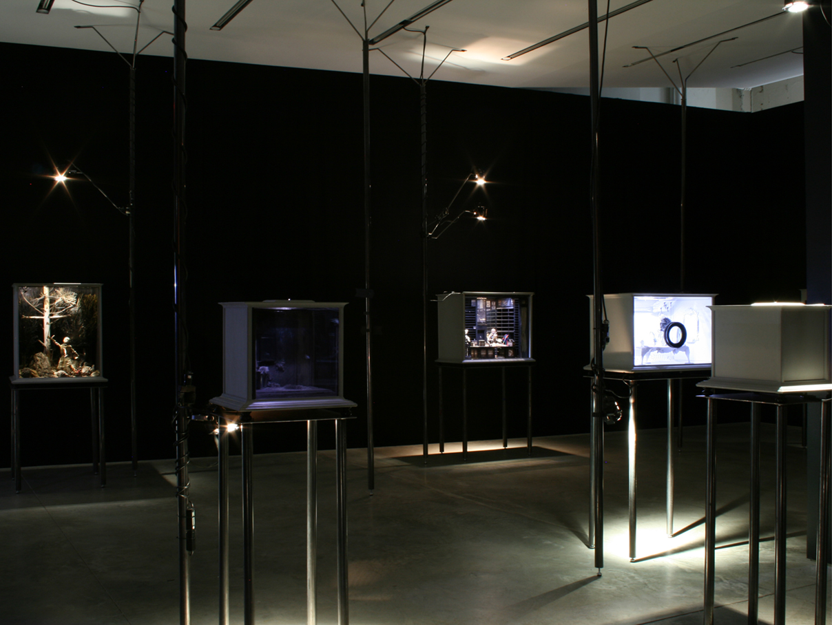
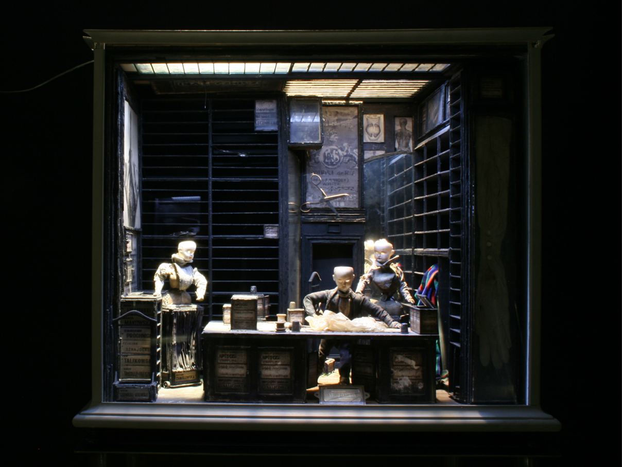
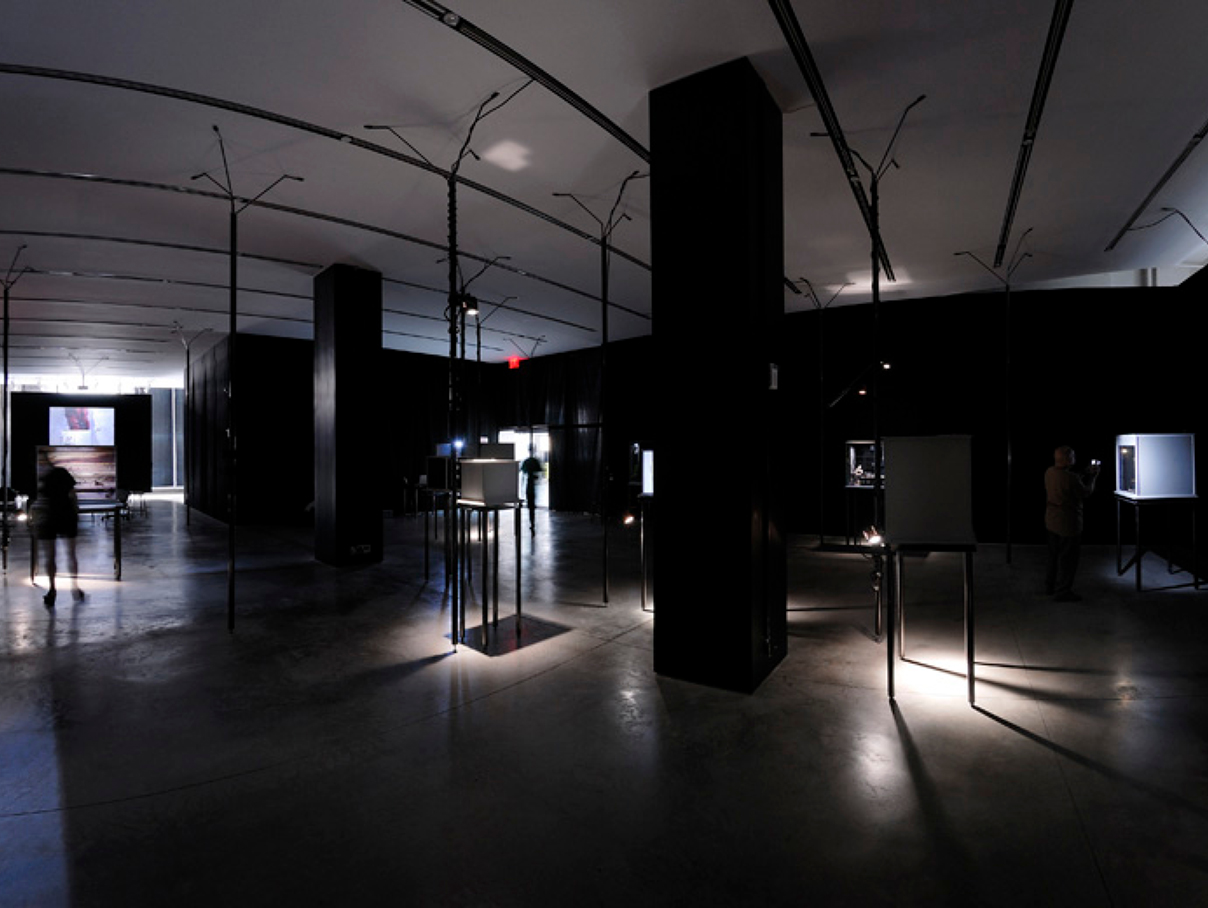
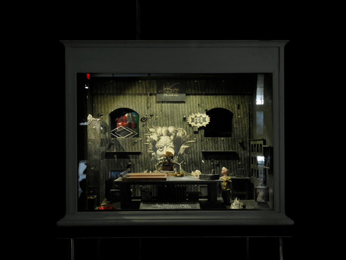
QUAY BROTHERS
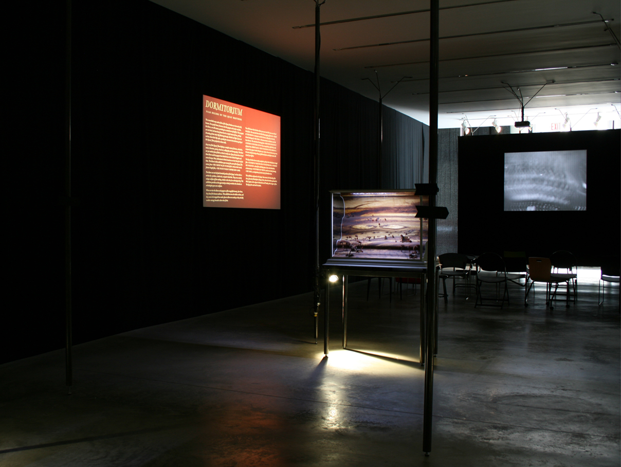
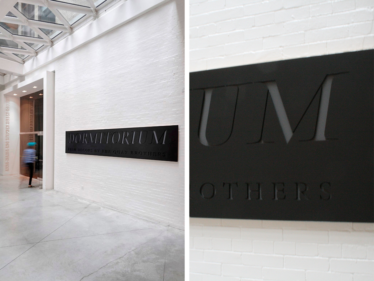
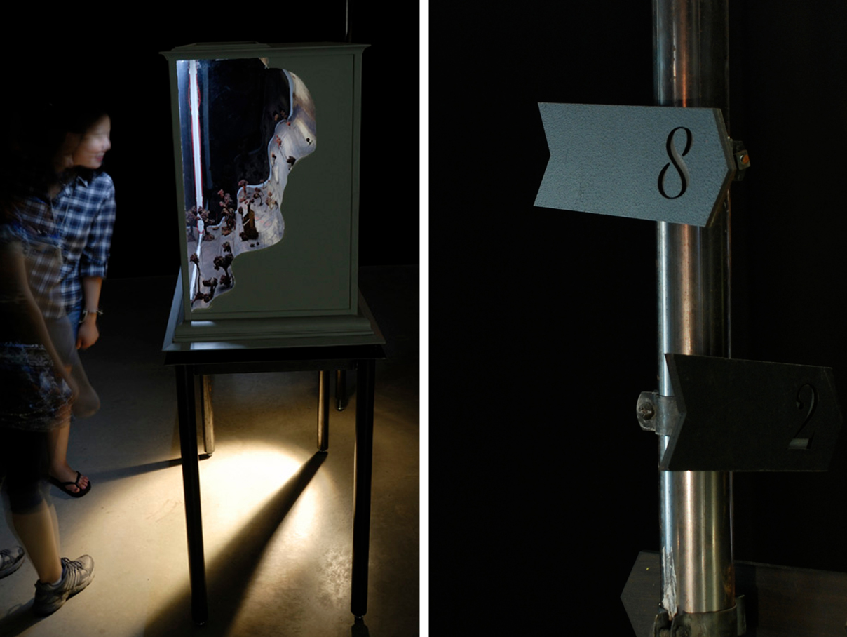
GALLERY | NEW YORK CITY
Film decors by the Quay Brothers is a one room exhibition with extremely low light levels. The exhibition signage was designed to work within these conditions, the title sign and object indicators were laser cut black MDF with a light grey MDF backing. This helped to illuminate the signage with little light.
The introduction text was related to their films produced on a 35mm slide and projected and a sequence of their famous stop motion films were shown to see these sets come to life.
TEAM: Matter Architecture Practice, Anna-Maria and Stephen Kellen Gallery at Parsons School of Design in New York City
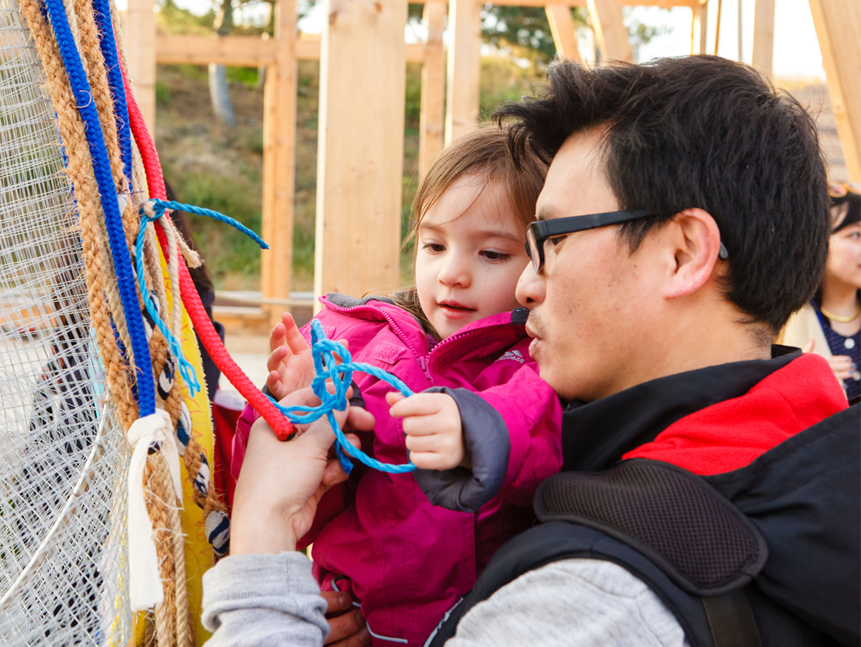
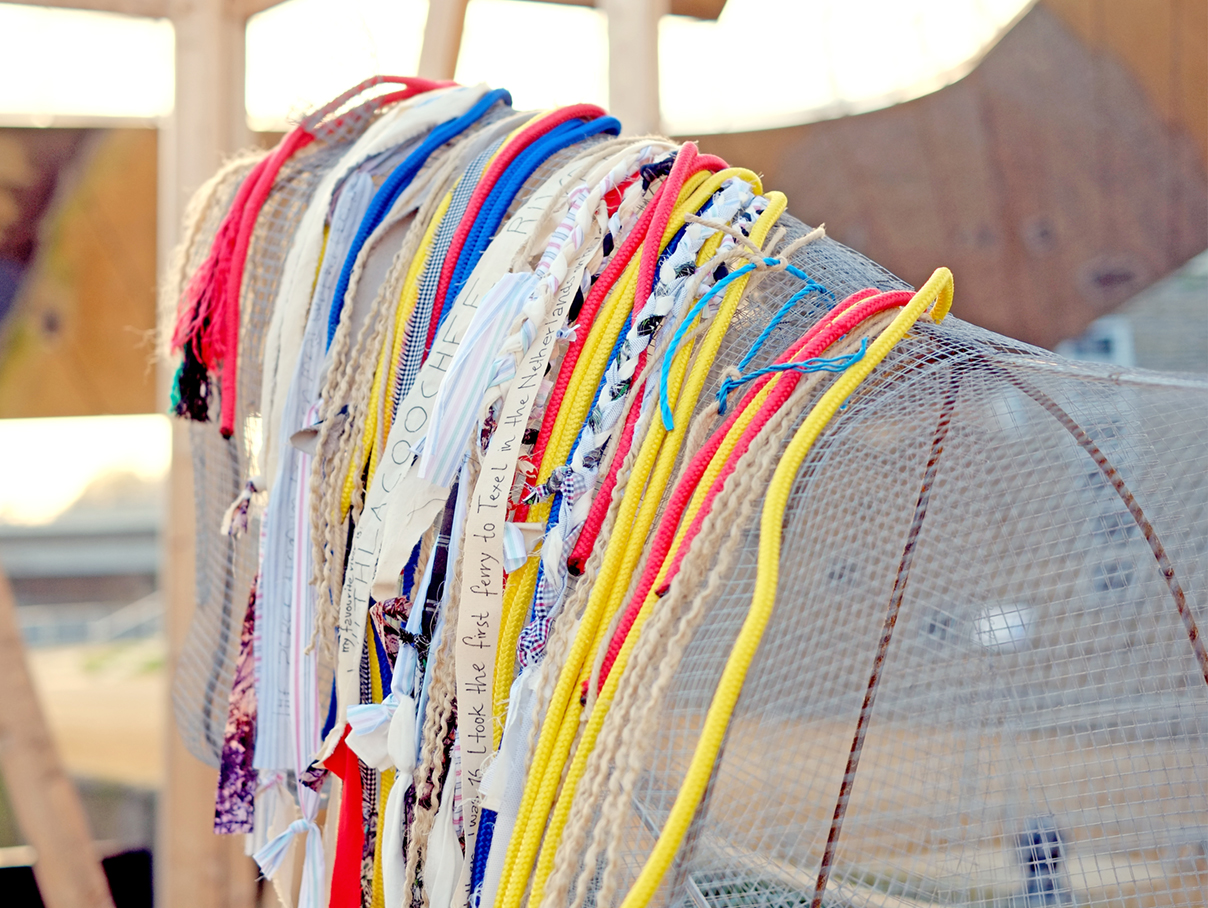
HUMAN ANIMAL MACHINE
OLYMPIC PARK | LONDON
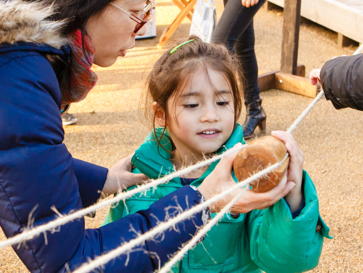
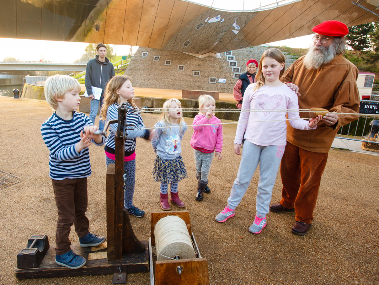
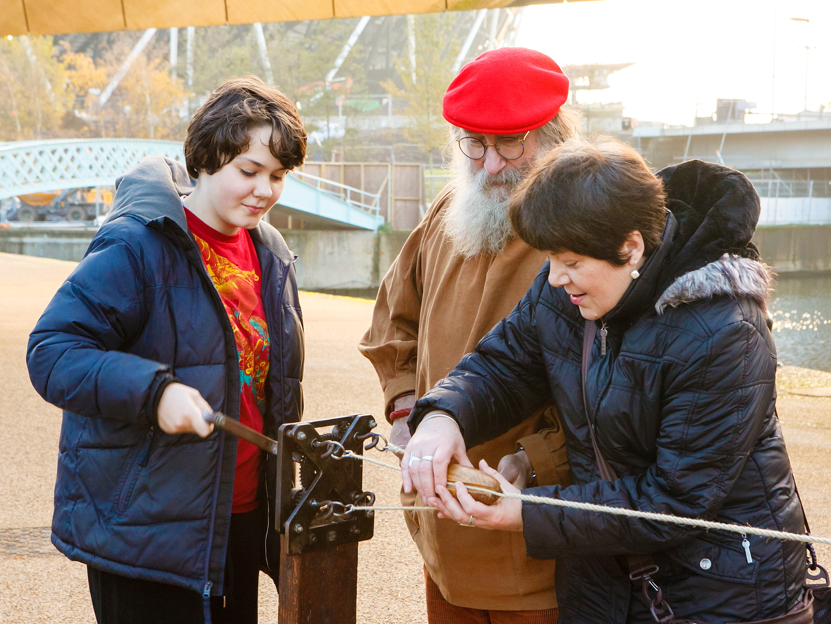
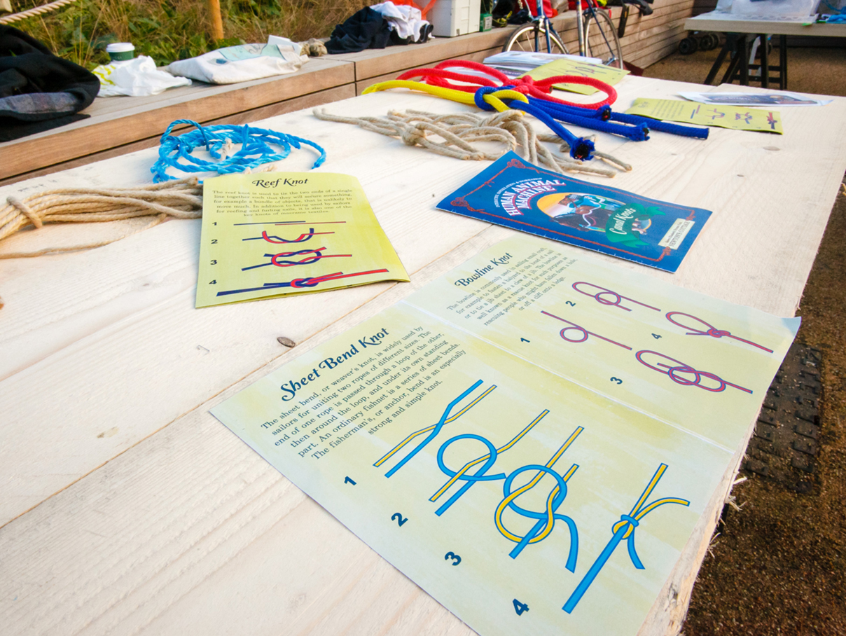
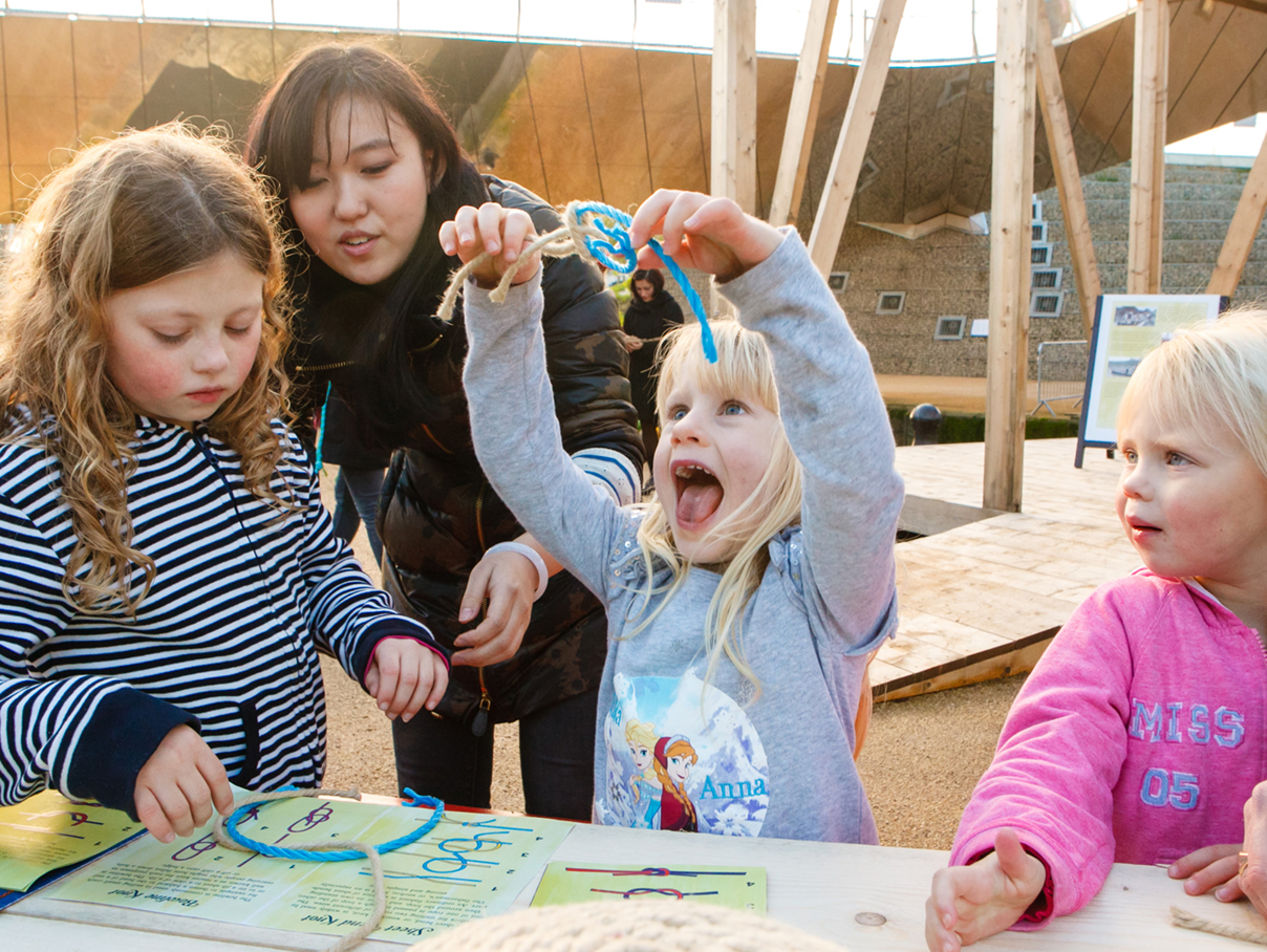
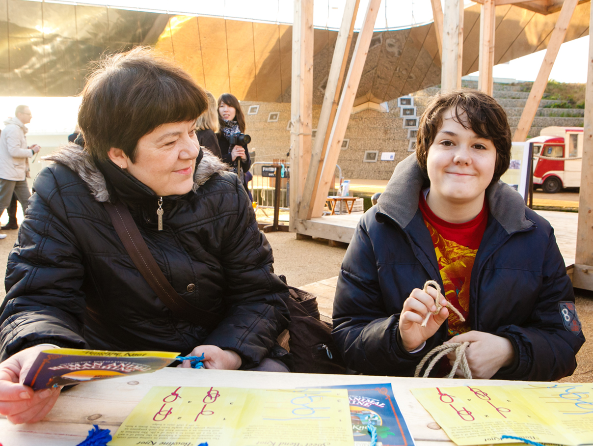
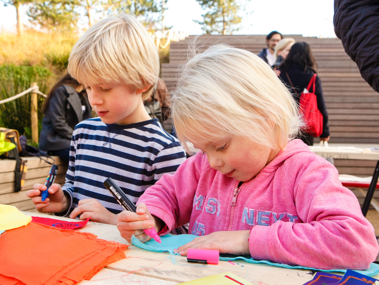
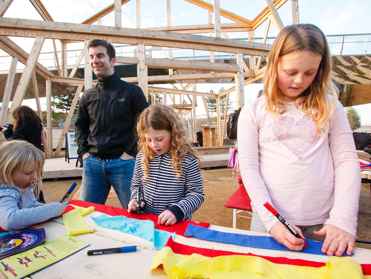
Newton’s Cottage echoes the form of the lock keeper’s cottage that once sat at Carpenter’s Road Lock, a historically significant lock over the River Lea. The narratives are created around the activities on the site and revealed that the canal systems in London rely on many things – humans, animals, and machines – all of which can be linked together by the use of rope.
We conceived an event with three activities: firstly, rope making led by expert rope makers Des & Liz Pawson; secondly knot tying in a variety of colourful materials; and thirdly we designed and made a life size wire horse that represented the shire horses that used to tow barges on the canals.
TEAM: Arif Wahid, Hannah Rogers, Pei–Hsin Chen, Takayuki Iishi, Yaqi Zhang, Des & Liz Pawson rope making, Lea Nagano video, Moira Lascelles curator, The Queen Elizabeth Olympic Park project-management in London, workshop video: https://tinyurl.com/y6l6xx8v
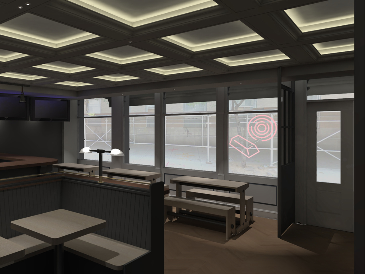
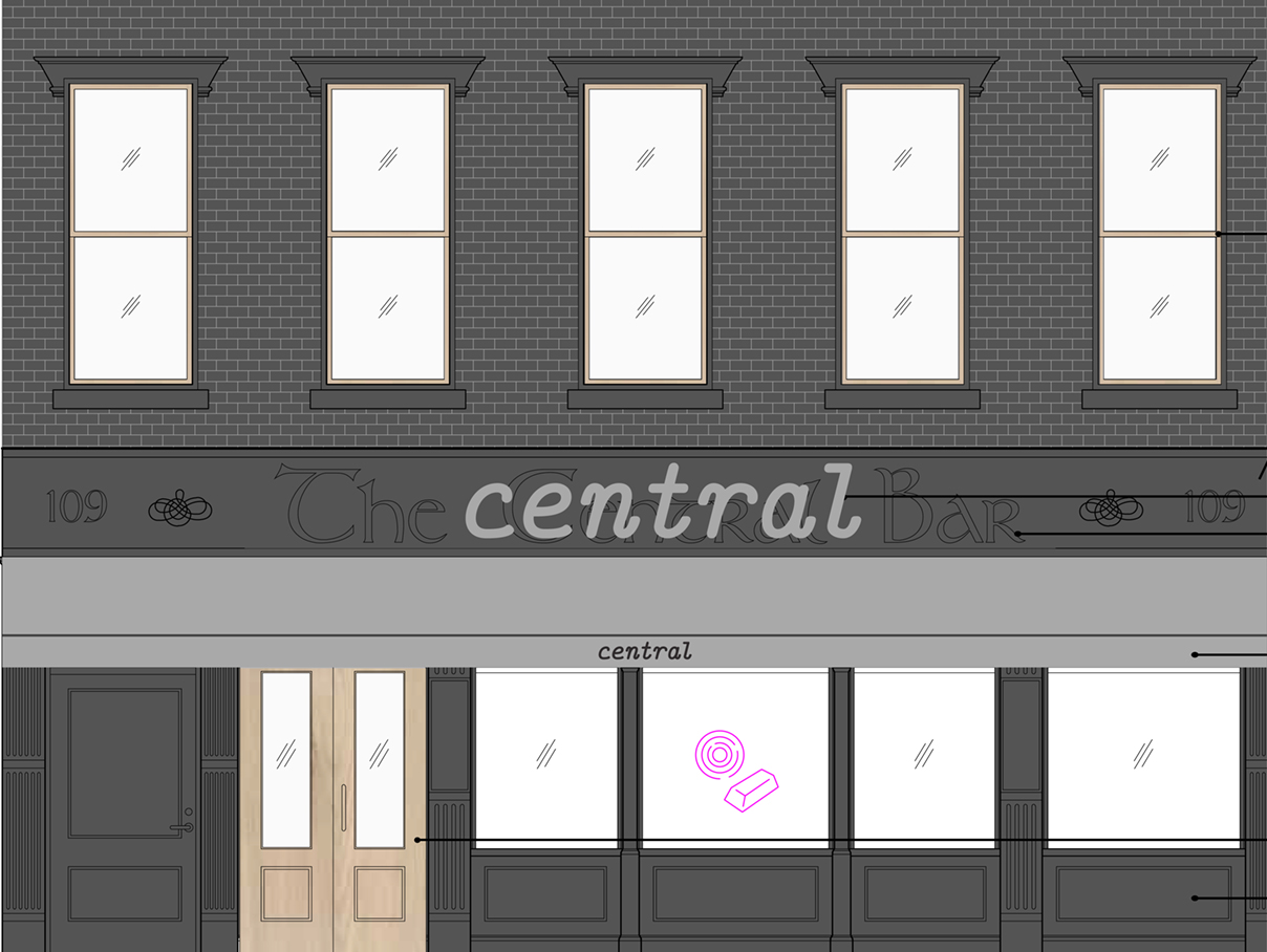
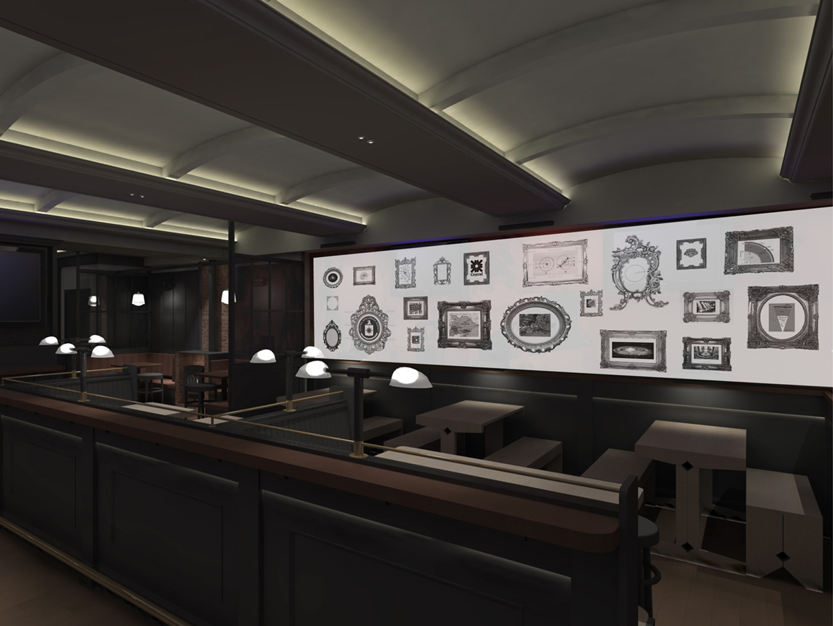
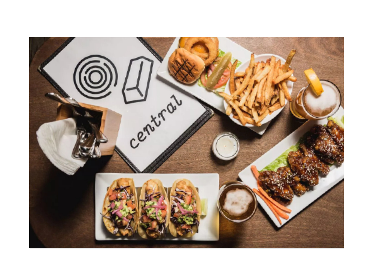
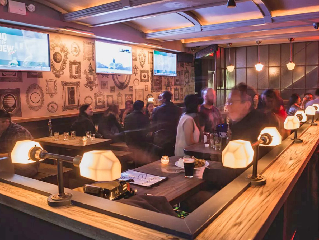
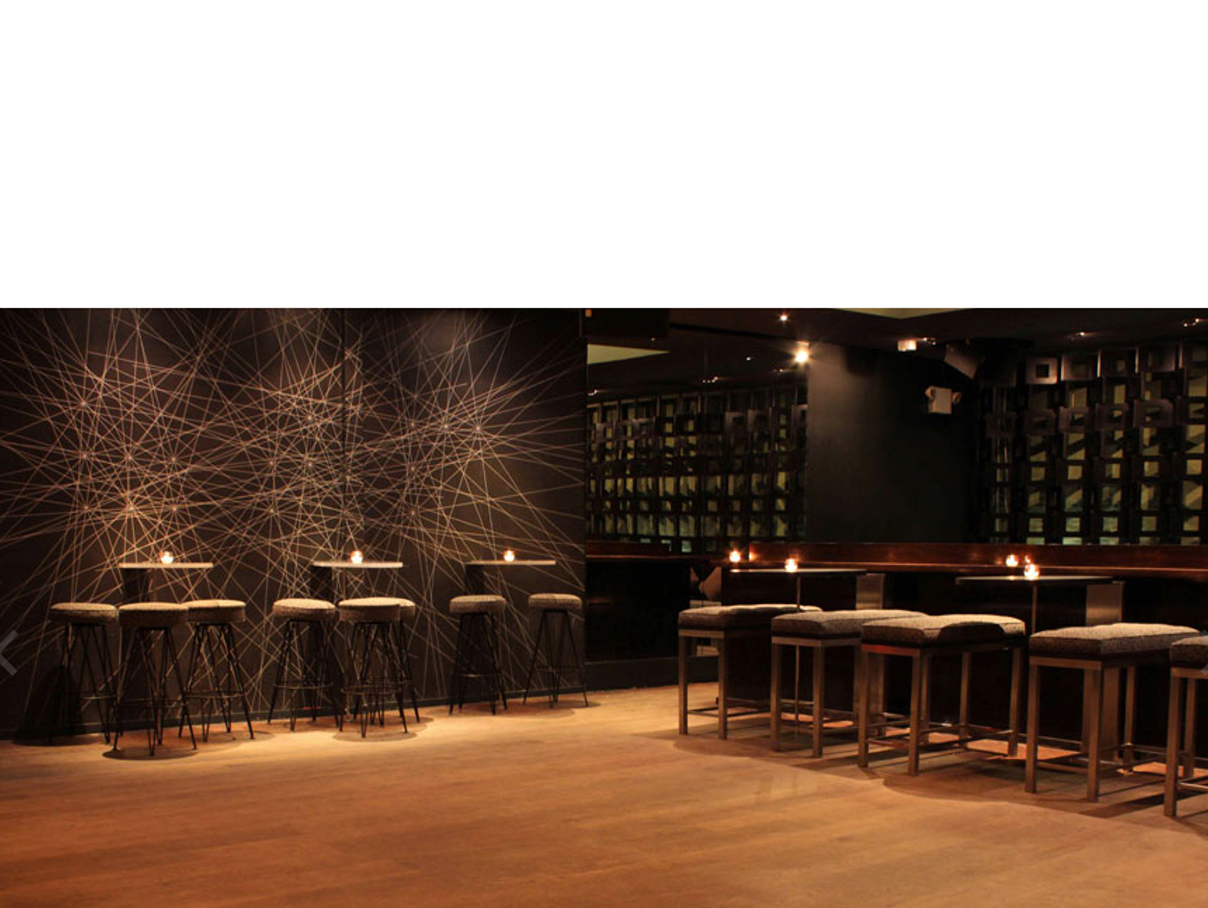
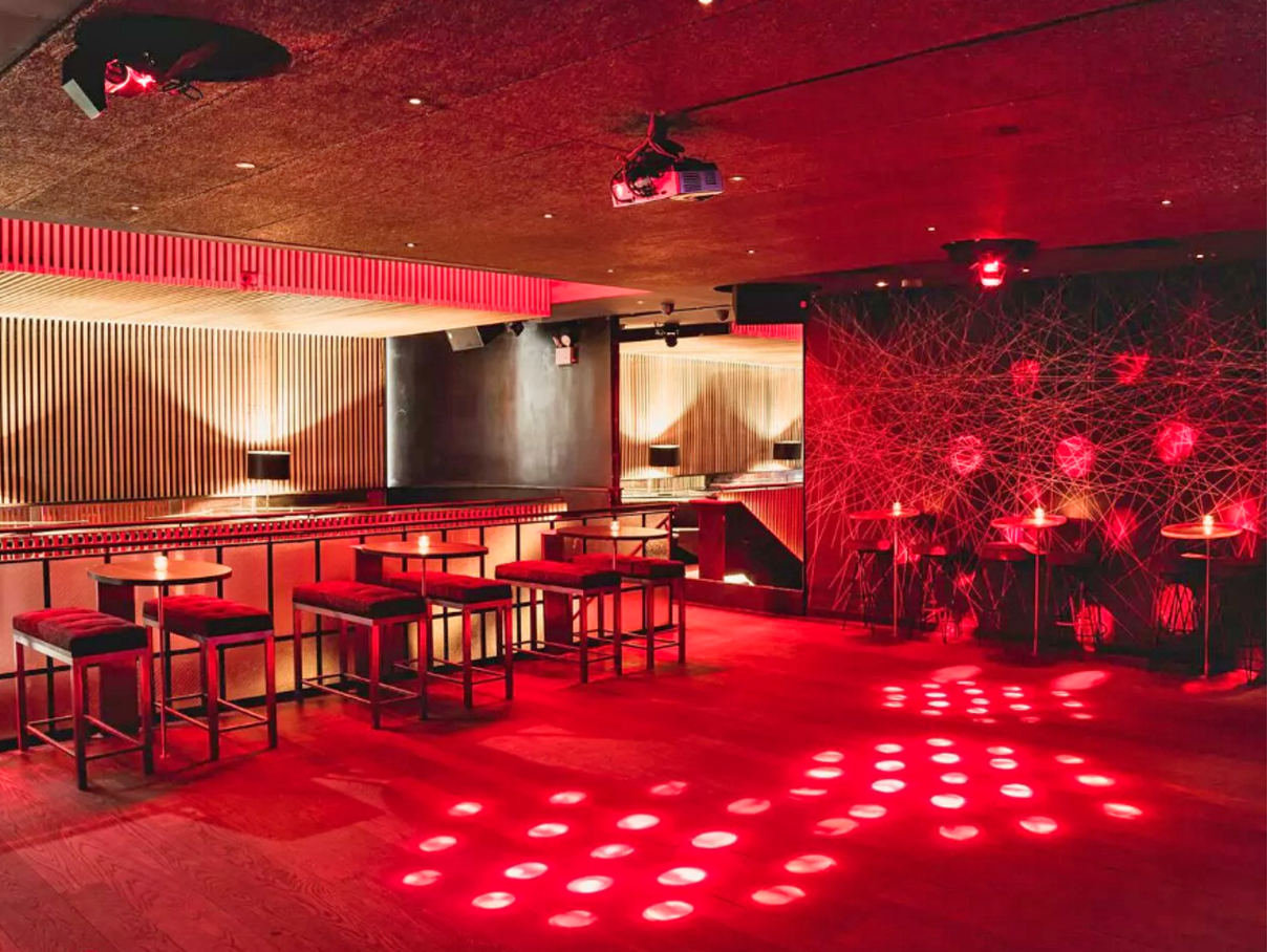
THE CENTRAL BAR
BAR | NEW YORK CITY
With the aim of expanding their audience in the evening hours, I created a concept, that literally overlays the current identity of The Central Bar with a new identity. In here the new signage explicitly functioned as a layer on its own presented as the symbolic meaning of the name.
In addition, several interior graphics were designed; black and white framed image, that present different central places in the world; line graphics with crossings highlighted by spotlights and its menu.
TEAM: Greg Yang Architects in New York City
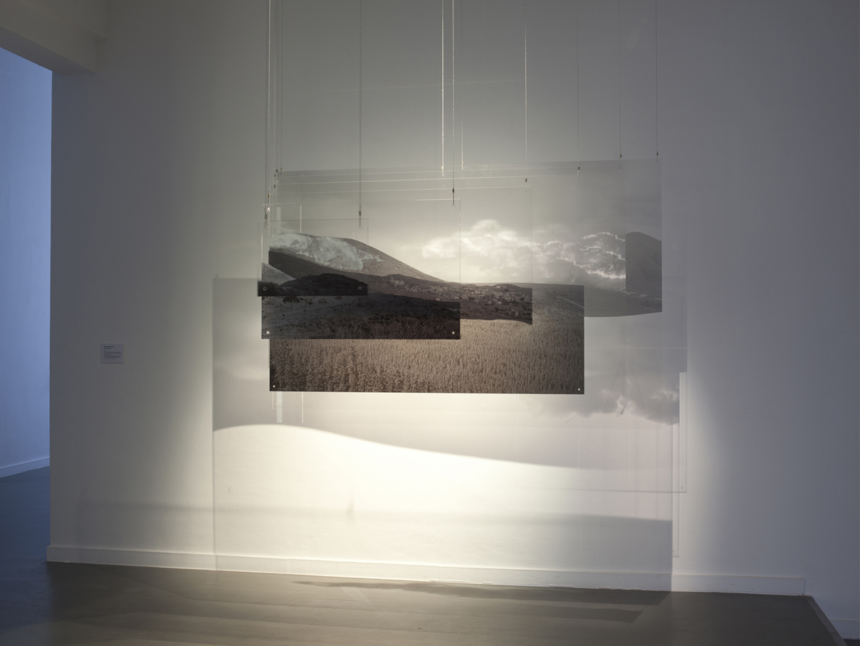
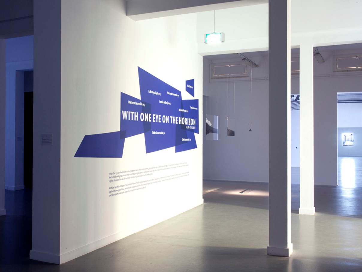
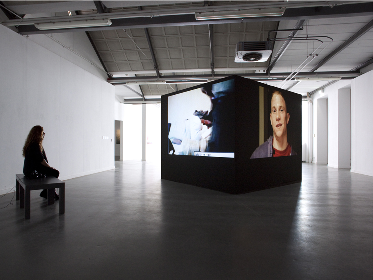
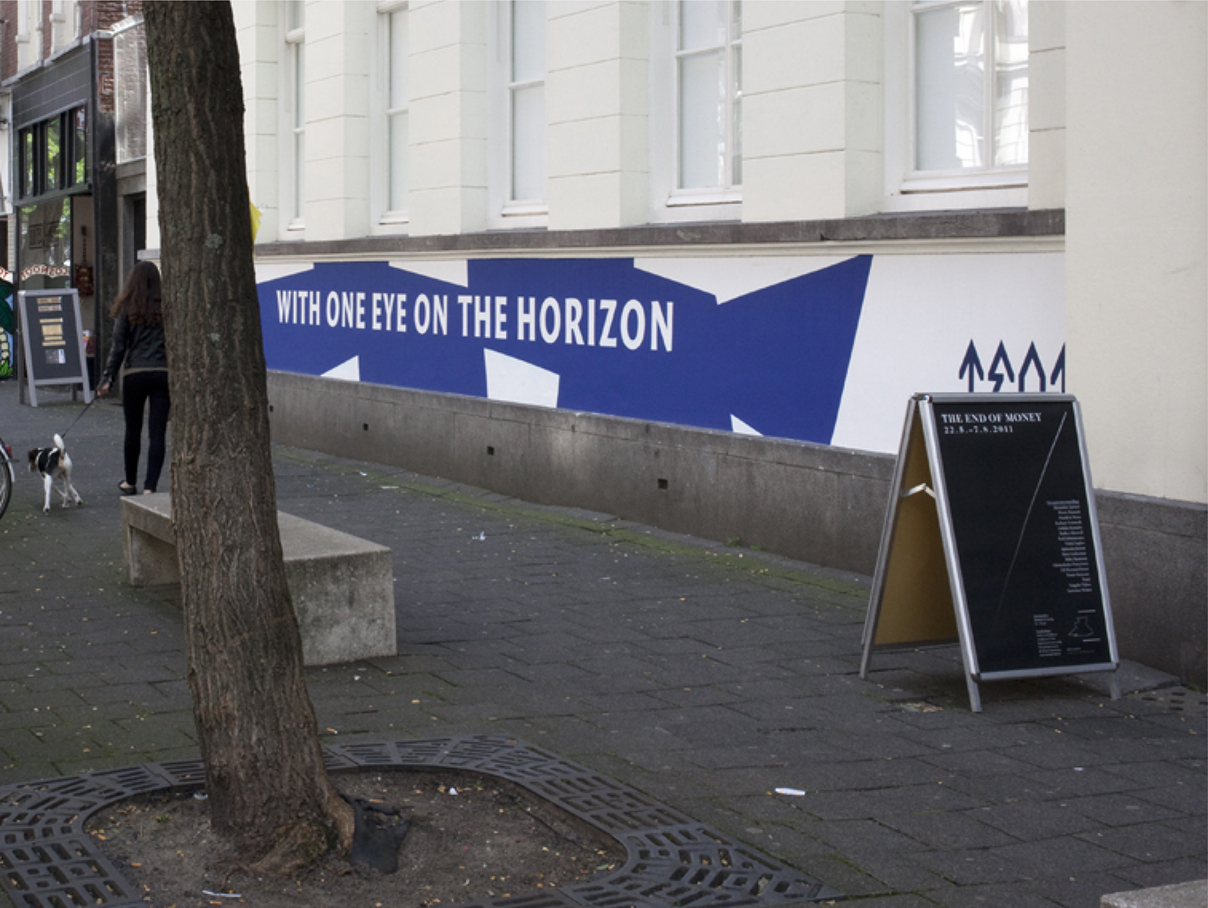
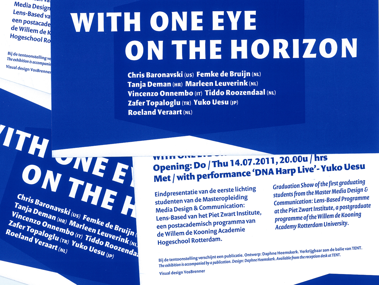
ON THE HORIZON
GALLERY | ROTTERDAM
Identity for the graduate show of students from the postgraduate Lens-Based Media Design program at the Piet Zwart Institute.
The program explores the possibilities of new media types and platforms for film. The identity is composed of different ratios of cinema screens which refer to the chroma key function.
TEAM: TENT. in Rotterdam
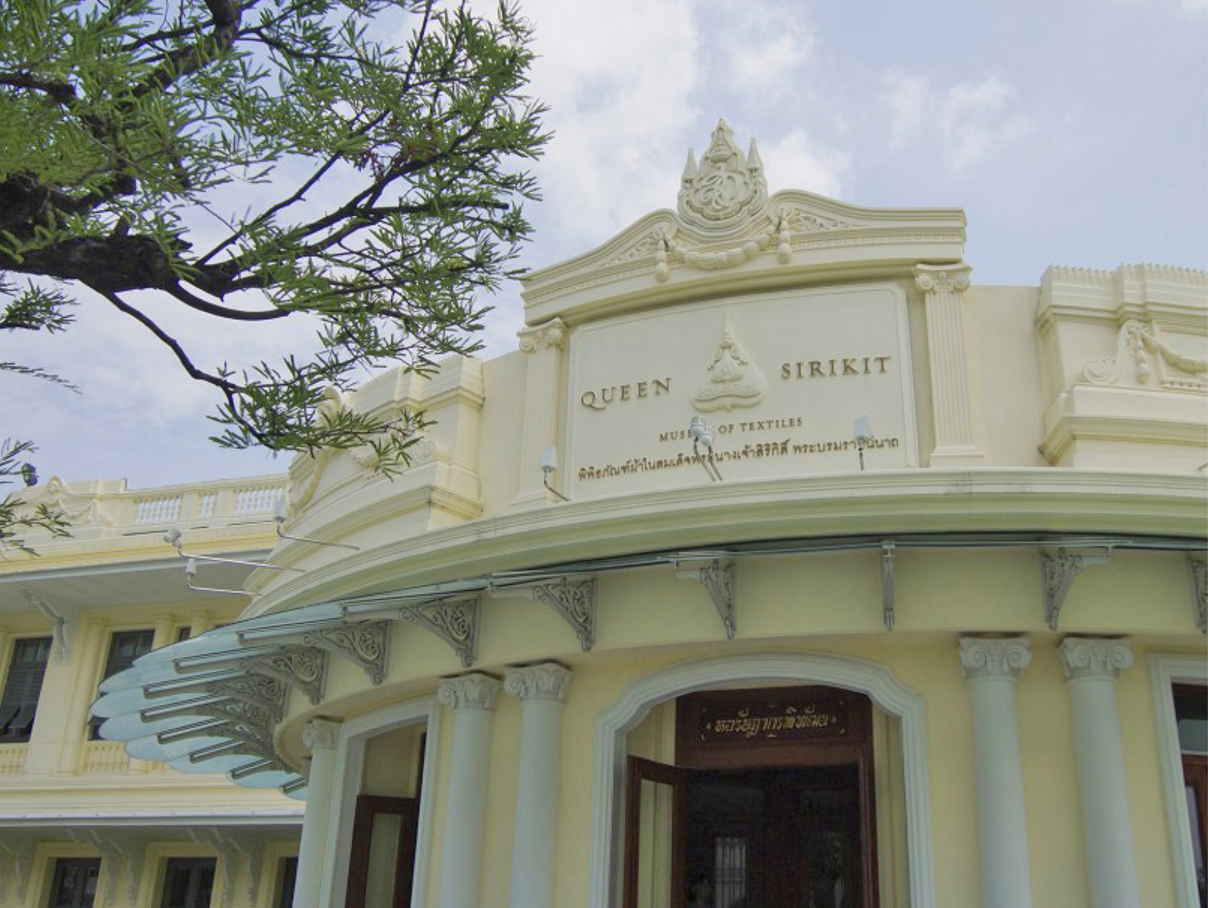
QUEEN SIRIKIT
MUSEUM OF TEXTILES | BANGKOK
Visual identity for the Queen of Thailand’s Textile Museum. The museum presents the rich history of the country’s own silk production. The identity had to be bilingual and include the logo of the Queen’s support foundation for communities involved in Thailand’s fabric production.
TEAM: Mgmt. Design, Queen Sirikit of Thailand in Bangkok